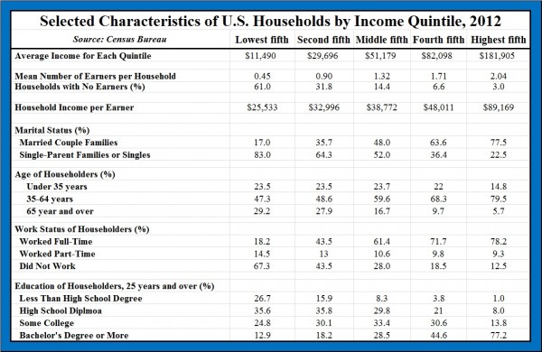
The above chart (as its title says) provides the details of U.S. households by income quintile. Economist Mark Perry summarizes some of the key differences between households (as of 2012):
1. On average, there are more income earners per household in the top quintile than in the lowest-income households.
2. Over 60% of the lowest-income households have no income earners, whereas the top quintile households have only 3% with no earners.
3. Over 75% of top quintile households are married couples, while this applies to only 17% of the lowest quintile households.
4. Nearly 80% of top quintile households fall within the prime earning ages of 35-64. Those in the bottom quintile are 1.6x more likely to be under 35 years of age and more than 5x more likely to be over 65 years old.
5. Nearly 80% of top quintile households include at least one adult working full-time compared to only 18.2% of those in lowest-income households.
6. Over 75% of those in the top quintile households have college degrees, while only about 13% of the lowest-income households.
As Perry summarizes,
Specifically, high-income households have a greater average number of income-earners than households in lower-income quintiles, and individuals in high income households are far more likely than individuals in low-income households to be well-educated, married, working full-time, and in their prime earning years. In contrast, individuals in lower-income households are far more likely than their counterparts in higher-income households to be less-educated, working part-time, either very young (under 35 years) or very old (over 65 years), and living in single-parent households.
The good news is that the key demographic factors that explain differences in household income are not fixed over our lifetimes and are largely under our control (e.g. staying in school, getting and staying married,etc.), which means that individuals and households are not destined to remain in a single income quintile forever.
