Pro-choice states have just as many unintended pregnancies and far more abortions.

If you’re into a lot of graphs and number crunching, read on. If you’re not, here’s the bottom line: compared to pro-life states, pro-choice states have more insurance coverage of contraception yet have roughly the same rates of unintended pregnancies and much higher rates of abortion.

In early 2015 the Washington Post published the article “States that are more opposed to abortion rights have fewer abortions — but not fewer unintended pregnancies.” Author Aaron Blake notes:

In fact, some of the states that oppose abortion the most also have some of the highest rates of unintended pregnancies — particularly in the South. And on average, the states that favor abortion rights the most have slightly lower levels of unintended pregnancies.

Blake elaborates:

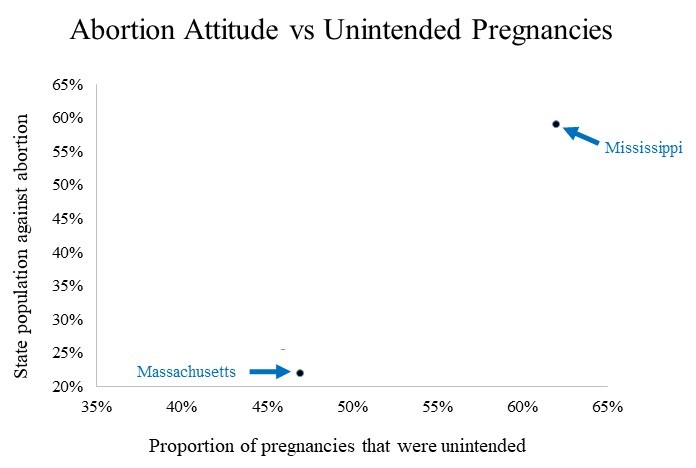
Mississippi, for instance, is the state that opposes abortion rights the most, according to Pew, with 64 percent generally opposing the procedure. It is also the state with the most unintended pregnancies, at 62 percent of all pregnancies, according to Guttmacher. After accounting for fetal loss, about two-thirds of those unintended pregnancies were brought to term.

By contrast, Massachusetts is one of the most pro-abortion-rights states, with just 28 percent of people opposing the procedure. But it’s also on the low end as far as the percentage of unintended pregnancies (44 percent). Far fewer — 43 percent — of those pregnancies were brought to term.

In both his article’s title and text Blake seems to imply a correlation between anti-abortion attitude and higher proportions of unintended pregnancies. This implication seems plausible because Blake focuses on only two data points among all 50 (51 if you count the District of Columbia). In fact if you plot the two states Blake highlights–Mississippi and Massachusetts–you get this graph:

So anti-abortion views mean more unintended pregnancies. The irony!

And yet the only time Blake addresses trends across the whole country, he admits:

On average in the 10 states that oppose abortion the most, 51 percent of pregnancies are unintended. In the top 10 states that most favor abortion rights, it’s 50 percent.

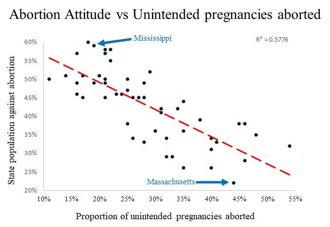
In other words, the two groups hardly differ at all. Out of curiosity I dug up the numbers used to measure unintended pregnancy (from Guttmacher) and abortion opposition (from Pew Research Center). Instead of comparing only the 10 most pro-life states to the 10 most pro-choice states, I looked at all 50 states (and DC). Here’s what it looks like when you don’t cherry pick:

I guess reality was too boring for this WaPo article.

So when you look at the whole data set (instead of only Mississippi compared to Massachussetts, or only the top 10 pro-life states compared to the top 10 pro-choice ones), there appears to be no relationship at all between views on abortion and unintended pregnancy.

I found this lack of correlation interesting. Pro-choicers often claim the best way to decrease abortion is not through outlawing abortion but through better access to contraception. If that theory is true, I would expect the states most open to abortion to also have lower unintended pregnancy rates, because (1) pro-choice states are more left-leaning, (2) left-leaning states are more likely to support better access to contraception, and (3) better access to contraception is supposed to decrease unintended pregnancies and thus abortion rates.

And yet the above graphic suggests that pro-choice states have no lower unintended pregnancy rates than pro-life states. Why is that? A few possibilities jump to mind:

  1. Pro-choice states don’t necessarily have better access to contraception than pro-life states.
  2. Pro-choice states do have better access to contraception, but that doesn’t actually decrease unintended pregnancy rates (and thus abortion rates).
  3. Pro-choice states have better access to contraception, and better access does decrease unintended pregancy rates, but some other factor in those states increases unintended pregnancy rates, thus cancelling the contraception effect.

I decided to dig a bit more. I used the same Guttmacher and Pew Research data linked above for unintended pregnancy info and state attitudes about abortion. To measure state access to contraception I used data from the Kaiser Family Foundation, which outlines which states require coverage of prescription contraception, related outpatient services, and no cost contraception coverage. I also looked at data collected by the National Women’s Law Center regarding which states have contraceptive equity laws (i.e. laws that require insurance plans to cover a full range of contraceptives for women). I assigned each state a contraception score by giving 1 point for each law or coverage requirement, with a maximum of 4 points.

Pro-choice states have more contraception access.

States with zero contraception coverage requirements had an average of 49% of their populations say abortion should be illegal in all or most cases. States with 2 or 3 contraception coverage requirements had 41% and 38% say abortion should generally be illegal. And states with all 4 contraception coverage requirements had only 32% of their populations say abortion should be illegal all or most of the time.

States with more contraception access don’t see lower unintended pregnancy rates.

I then averaged the unintended pregnancy rates for states based on their contraception score and it looked like this:

(There were no states with a score of 1. Every state that had contraception access requirements in place had two or more such requirements.)

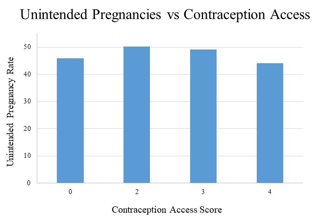
The states with the most contraception coverage requirements had the lowest unintended pregnancy rate at 44 per 1,000 women age 15-44. The states with zero contraception coverage requirements had the next lowest rate at 45.95. The states in between–with 2 or 3 contraception coverage requirements–had higher unintended pregnancy rates at 50.25 and 49.08 respectively. In other words there’s no obvious relationship between states’ contraception coverage requirements and their unintended pregnancy rates.

States with less access to contraception have lower abortion rates.

Since I already had the data handy I also compared state contraception access to abortion rates:

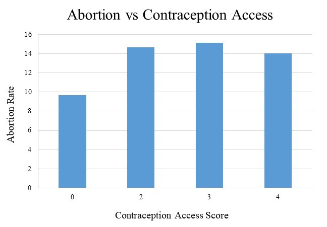
The states with zero contraception coverage requirements had the lowest abortion rates at 9.68 abortions per 1,000 women age 15-44. States with 2, 3, and 4 contraception coverage requirements had rates of 14.58, 15.14, and 14.00, respectively.

This result could imply that contraception access actually increases abortion rates, and many pro-lifers try to make that claim. Their theory is that whenever you have a desirable but risky action (sex), the more you lower the risk the more often people will take that action. If people think the risk is lowered more than is actually the case (e.g. if the contraception they’re using or the way they’re using it isn’t as effective as they think), then they may be actually increasing their risk exposure by taking a risky action more often without proportionally decreasing the risk in each instance. This theory is plausible because states with more contraception access do not have lower unintended pregnancy rates. Perhaps these populations lower the risk of a given instance of sex by using contraception but increase their overall risk exposure by having sex more often without using contraception consistently or correctly.

Pro-choice states have higher abortion rates.

Alternatively, perhaps the high contraceptive states have higher abortion rates simply because they are more pro-choice states. Given roughly equal unintended pregnancy rates, we’d expect the populations that support abortion to have higher abortion rates, and the data bears that out.

This trend may be due to social influences. It’s possible that women experiencing unintended pregnancies in more pro-life states experience more pressure not to abort, more encouragement and support to carry their pregnancies, or both, and that women in more pro-choice states experience the opposite. It’s hard to measure how much social pressures influence these decisions.

Either way, though, there’s little doubt that legal restrictions also influence women’s choices. To measure state-by-state legal restrictions, I again turned to Guttmacher. I assigned each state points based on whether they had the following restrictions in place and, if so, to what degree. The potential restrictions include:

  1. Whether the abortion must be performed by a licensed physician
  2. Whether and when the abortion must be performed at a hospital
  3. Whether and when a second physician must be present
  4. Whether and when abortion is prohibited (except life or health of the mother)
  5. Whether partial birth abortion is banned
  6. Whether public funding can be used for most abortions or very few abortions
  7. Whether private insurance has to cover abortions
  8. Whether individuals can refuse to participate in abortions
  9. Whether and when institutions can refuse to participate in abortions
  10. Whether there is mandated counseling regarding either an abortion breast cancer link, fetal pain, negative psychological effects, or any combination of those factors
  11. Whether and how long mandatory waiting must be
  12. Whether parents have to be notified or have to consent to their kids’ abortions

States with more legal restrictions garnered more points with a maximum possible 12 points. Unsurprisingly, there was an inverse correlation between the number of abortion restrictions and the proportion of unintended pregnancies aborted.

Contraception is not a panacea for abortion.

Pro-choice people repeatedly claim that if we truly care about lowering abortion rates we should support pro-choice policies and politicians who promote contraception access. As I’ve written about previously, this theory isn’t backed by the evidence. There’s some research to suggest contraception access–especially access to long acting reversible contraception–can help, but so far the evidence I’ve found continues to show that the abortion rate decreases more when there are more abortion restrictions than it does when there is more access to contraception.

Does Immigration Increase Income Inequality?

Image result for immigrants

According to Harvard economist Edward Glaeser,

Cities aren’t full of poor people because cities make people poor, but because cities attract poor people with the prospect of improving their lot in life. The poverty rate among recent arrivals to big cities is higher than the poverty rate of long-term residents, which suggests that, over time, city dwellers’ fortunes can improve considerably. The poorer people who come to cities from other places aren’t mad or mistaken. They flock to urban areas because cities offer advantages they couldn’t find in their previous homes…The absence of poor people in an area is a signal that it lacks something important, like affordable housing or public transportation or jobs for the least skilled. The great urban poverty paradox is that if a city improves life for poor people currently living there by improving public schools or mass transit, that city will attract more poor people.

In short, “The flow of less advantaged people into cities from Rio to Rotterdam demonstrates urban strength, not weakness…Urban poverty should be judged not relative to urban wealth but relative to rural poverty.” In my view, Glaeser’s insight is incredibly important. Not only does it stress the need for proper comparisons, but also highlights the difference between absolute mobility and relative inequality. This indicates that if city officials were to focus solely on the poverty rate or level of inequality within their cities without tracking mobility and length of residency, they could very well be misdiagnosing the situation.

I think a similar approach can be taken concerning poverty and inequality within the United States. What if inequality in the United States isn’t necessarily because of some abstraction like “the rich,” but is due to the amount of low-income immigrants we’ve taken in over the last several decades? Yes, within-country inequality has grown, but is it in part due to low-skill, low-education workers escaping the poverty of their origin countries and becoming better off by coming here (therefore, lowering between-country inequality)?

A new paper from Mission Foods Texas-Mexico Center at SMU explores the effects of immigration on inequality. After reviewing the economic literature, the authors conclude

that low-skilled immigration to the U.S., much of it from Mexico, has only played a minor role in rising income and wage inequality. To the extent that there is an effect, it has come through the presence of immigrants, and less as a result of immigration’s effect on natives’ wages. Immigrants’ bimodal skill distribution, with clustering at the top and bottom of the U.S. skill distribution, has widened the overall income distribution slightly. At the same time, low-skilled immigration to the U.S., and migrants’ remittances, have played a large role in lowering global inequality by moving millions of low-income Mexican families further away from poverty and closer to the global middle class.

Migration from poor to rich countries represents a reallocation of labor that increases the wage of the migrant while also raising wages in the sending country. It moves labor to capital-rich countries where businesses readily employ it. Productivity and output rise. As long as business investment responds to the worker influx, wage effects on native workers will be limited. Migration is the last frontier of globalization. Removing barriers to international mobility would result in large economic gains that far outweigh any costs (pg. 11-12).

Though it only plays a small role, immigration has increased inequality within the U.S. because poor non-citizens became less poor. Elsewhere, Pia Orrenius–vice president and senior economist at the Federal Reserve Bank of Dallas and one of the authors of the paper above–explains further:

We surveyed the literature that’s out there and we found two high quality studies that showed that all this out migration from Mexico has actually increased wages in Mexico. That is consistent with economic theory. If there’s fewer workers they should command a higher return…You might think that if migration raises wages in Mexico, it should lower them in the U.S. But what the surveys of literature say is that there’s actually only a very small impact on the wages of native workers in terms of the competition with immigrants, and there’s many reasons for that. The main reason is that there really aren’t a lot of low-skilled workers in the U.S. who compete with immigrants. You’re looking at a small and shrinking group of workers and so there’s not a lot of effect there.

Where we did see an impact is on the income distribution. When Mexican immigrants come in, for example, they have very low levels of education and so they come into the U.S. and they initially earn very low wages. So just by virtue of them coming into the country they’re actually broadening the income distribution by coming into the low end. So just mechanically there’s more income inequality because they’re coming in at very low wage jobs that generally Americans are not filling.

So there’s a mechanical reasoning for the increase in income inequality that’s partly related to migration, but generally we found in looking at the literature the bigger reasons are what’s called routine bias technological change and the hollowing out of the middle of the income distribution. And that’s due to technological change and the replacement of workers and routine-based occupations. We call that labor market polarization.

Labor market polarization or the hollowing out of the middle class is not consistent with migration from Mexico because again immigration from Mexico is coming in at the very low end of the distribution. So that’s how we concluded that there’s a lot going on here, but generally the main driver for income inequality in the U.S. and other countries is not low-skilled immigration.

…The other thing that we noted, and this is actually really important, is that if we’re looking at income inequality in the United States or in western Europe, yes you do see increasing income inequality. We’re unhappy with that—obviously that isn’t something that people want to see. But what we urge people to do in the paper is to look at the global income inequality. Thanks to globalization, we’ve actually seen falling income inequality in the world. So the world as a whole is better and better and better off. We’re richer as a world; we’re less unequal as a world, thanks to all of these trends that are going on. So what’s going on in the world globally is not the same as what’s going on in these individual countries.

It’s very important to remember that some of these trends that we see as negative in the U.S. are actually positive globally because they’ve allowed the poorest people in the world, like the people in India, the people in China to come out of abject poverty and actually join at least the lower middle class or the middle class.

The globalization of capital and labor may contribute to inequality within rich countries, but it’s making the world as a whole a more equal place.

Immigration, Ignorance, and Redistribution

The link between political ignorance, immigration policy preferences, and support for redistribution are well-established. I’ve shared this portion from my BYU Studies Quarterly article before, but it’s worth repeating:

A particularly interesting aspect of public attitudes toward immigration is that of political ignoranceMultiple studies have shown that political ignorance is rampant among average voters, and this holds true when it comes to immigration policy. As legal scholar Ilya Somin explains, “Immigration restriction . . . is one that has long-standing associations with political ignorance. In both the United States and Europe,survey data suggest that it is strongly correlated with overestimation of the proportion of immigrants in the population, lack of sophistication in making judgments about the economic costs and benefits of immigration, and general xenophobic attitudes toward foreigners. By contrast, studies show that there is little correlation between opposition to immigration and exposure to labor market competition from recent immigrants.” One pair of economists found that those voting to leave the European Union in the Brexit referendum, who were motivated largely by a desire to restrict immigration, “were overwhelmingly more likely to live in areas with very low levels of migration.” Similarlyvoters who supported Donald Trump during the US election were more likely to oppose liberalizing immigration laws (even compared to other Republicans), but least likely to live in racially diverse neighborhoods. In short, both political ignorance and lack of interaction with foreigners tend to inflame anti-immigration sentiments. These sentiments are what George Mason University economist Bryan Caplan refers to as antiforeign bias: “a tendency to underestimate the economic benefits of interaction with foreigners.” In fact, economists take nearly the opposite view from the general public on immigration (pgs. 80-82).

In regards to immigrants’ impact on welfare and the fiscal budget, I wrote,

A 2017 literature review by the National Academy of Sciences finds that the “fiscal impacts of immigrants are generally positive at the federal level and negative at the state and local levels” because state and local governments are the main providers of education benefits. Thee authors of the review are also quick to point out,“the net fiscal impact for any U.S. resident, immigrant or native-born,  is negative. When fiscal sustainability is assumed to result in future spending cuts and tax increases, immigrants are more valuable than native-born Americans (that is, their net fiscal impact is greater in a positive direction).” These findings echo those of [Alex] Nowrasteh’s review of the literature. According to Nowrasteh, between 1950 and 2000, “immigration grew the US economy and produced more net tax revenue. . . . The low-skilled first generation consumed more welfare than they paid in taxes,but their descendants more than compensated for that initial deficit by producing a more positive dependency ratio for entitlement pro-grams, leading to a slightly positive contribution to the federal budget in the long run.” While many economic models “find that immigrants slightly diminish net tax revenue for state and local governments,” they increase the federal net tax revenue by more than the state and local decrease. Furthermore, “there is little evidence that migrants choose their state destination based on the generosity of the welfare system. . . .New immigrants are mainly choosing to reside in states with low levels of social welfare spending and growing economies and are moving away from states with high levels of social welfare spending and low economic growth.” Nonetheless, even if welfare spending did increase due to immigration (evidence suggests quite the opposite), this would be an argument for increasing restrictions on welfare, not immigrationOverall, as Nowrasteh concludes, “The economic benefits of immigration are unambiguous and large, but the fiscal effects are dependent upon the specifics of government policy over a long time period, which means that the net fiscal impact of immigration could be negative while the economic benefit is simultaneously positive. Looking at the results of all of these studies, the fiscal impacts of immigration are mostly positive, but they are all relatively small” (pgs. 99-100).

A recent study provides further support for these findings:

In a recent study (Alesina et al. 2018) we used commercial market research companies to run a large-scale survey and experiment on a representative sample of more than 22,000 natives in six countries: France, Germany, Italy, Sweden, the UK, and the US, mostly between January and March 2018. The sample countries were chosen because they have different economic and social systems, but all have recently faced policy challenges around immigration…In five of the six countries, the average native believed that there are between two and three times as many immigrants as there are in reality. For instance, in the US legal immigrants are about 10% of the population, but US respondents thought the figure was 30%. Similar gaps existed in Germany, France, Italy, and the UK. In Sweden, the country with the highest proportion of immigrants, the public perception of 27% was closest to the true share (18%).

Natives also got the origins of immigrants wrong. They particularly overestimated the shares of immigrants coming from regions that have recently been described as ‘problematic’ in the media, and the share of non-Christian immigrants – Christianity being the mainstream religion in their country. In all countries except France, respondents overestimated the share of Muslim immigrants. The US and Sweden had the biggest misperception. In the US, respondents thought the share of Muslim immigrants was 23% when in reality it is 10%, and in Sweden they believed the share was 45%, when it is 27%. In the UK, Italy, and Germany, this overestimation ranged from 10 to 14 percentage points. In all countries, including France, respondents underestimated the share of Christian immigrants by at least 20 percentage points. For instance, US respondents thought that 40% of immigrants were Christian, when 61% are. UK respondents believed 30% of immigrants were Christian, when the true figure is 58%. 

In all countries, immigrants were viewed as poorer, less educated, and more likely to be unemployed than is the case. For instance, US natives believed that 35% of immigrants lived below the poverty line, while the real number is less than 14%. Natives also believed that immigrants relied heavily on the welfare state, with roughly one-third of all US, Italian, and French respondents, and one-fifth of all UK and German respondents, believing that an immigrant would receive more benefits than a native, even if both had exactly same income, family structure, age, and occupation. A large share of respondents also thought that immigrants were poor mainly because of lack of effort, rather than adverse circumstances.

These misperceptions were widely spread across all countries and groups of respondents. They were larger for respondents who are not college educated, who said they supported right-wing parties, or who worked in low-skilled occupations in immigration-intensive sectors. Respondents who personally knew an immigrant had less biased perceptions. Respondents in all countries also greatly exaggerated the share of immigrants among the poor or the low-educated. For example, US respondents thought that 37% of the poor were immigrants; the true number is 12%. 

These skewed perceptions may lead natives to conclude that immigrants are a burden on the public finances of their country, and that they disproportionately benefit from redistribution. In fact, there is a strong negative correlation between the perceived share of poor who are immigrants and support for redistribution. This was captured by a redistribution support index that summarised the answers to all redistribution-related questions. Respondents who perceived that a larger share of the poor were immigrants supported less redistribution, even controlling for a detailed set of personal characteristics. Similarly, respondents who supported more immigration overall, as captured by an immigration support index that aggregated the answers to all questions related to attitudes towards immigration, also supported more redistribution.

The authors also found that “simply making respondents think about immigrants and their characteristics made respondents much more averse to redistribution. These respondents also decreased their actual out-of-pocket donations to charities that support low-income groups but do not target immigrants.” The good news is that accurate information regarding “the true characteristics of immigrants – their share, their origins, and their work ethic…significantly increased support for immigration policies.” For example, “Showing the respondents a day in the life of a hard-working immigrant fostered support for redistribution – confirming the importance of views about effort and ‘deservingness’ of the poor, as highlighted in the case of poor natives in Alesina and Glaeser (2004) and Alesina et al. (2018). But the experiments that showed respondents the true share and origins of immigrants did not generate significantly more support for redistribution.” Unfortunately, “negative priors dominated in subsequent answers to redistribution questions, even when they also received favourable information about immigrants.”

It’s an uphill battle.

Has War Really Declined Since WW2?

From a recent working paper:

we give a simple exposition of the central ideas behind the new critiques of the decline-of-war thesis made by Cirillo and Taleb (2016b) and Clauset (2018). Note that these ideas hinge centrally on the original insight of Richardson (1948) into the fat-tailed size distribution of modern wars. This connection provides the relevance of our paper to the present book. Second, we transform the war-size data into units of battle death per 100,000 or world population rather than absolute battle deaths and argue that these units are appropriate for investigating the probability that a random person will die in a war. We show that this change tilts the evidence towards rejecting the no-change hypothesis; it does not on its own result in formal rejection at a standard significance level but it does move us toward a preponderance of evidence against no change. Third, we show that sliding the candidate break point slightly forward in time, to 1950 rather than 1945, leads us further down the path toward formal rejection of the no-change hypothesis. Finally, we expand range of wars to include not just the interstate wars considered by Clauset (2018) but also intra-state wars. Now we do formally reject the no-change hypothesis. Finally, we show that our results do not depend on the choice between two widely used war datasets.

From one of the authors:

We can read off the picture on the right…that wars killing more than 45 people per 100,000 of world population after 1950 have been much less common than such wars were before 1950.  Indeed, the estimated probability that the pre-1950 war generation mechanism continued to operate after 1950 for wars of sizes above 45 per 100,000 is only around 0.05.  So we can even formally reject a hypothesis that nothing changed after 1950 for wars of sizes 45 per 100,00 and above.

gleditsch_all


Global Study: Alcohol Is Bad For You (Surprise)

Image result for why is the rum gone gif
Because it’s bad for you.

From CNN:

If you’re one of the third of all humankind who drinks alcohol, take note: There’s no amount of liquor, wine or beer that is safe for your overall health, according to a new analysis of 2016 global alcohol consumption and disease risk. Alcohol was the leading risk factor for disease and premature death in men and women between the ages of 15 and 49 worldwide in 2016, accounting for nearly one in 10 deaths, according to the studypublished Thursday in the journal The LancetFor all ages, alcohol was associated with 2.8 million deaths that year. Those deaths include alcohol-related cancer and cardiovascular diseases, infectious diseases such as tuberculosis, intentional injury such as violence and self-harm, and traffic accidents and other unintentional injuries such as drowning and fires.“The most surprising finding was that even small amounts of alcohol use contribute to health loss globally,” said senior study author Emmanuela Gakidou, a professor at the University of Washington’s Institute for Health Metrics and Evaluation. “We’re used to hearing that a drink or two a day is fine. But the evidence is the evidence.”

It continues:
University of Cambridge epidemiologist Steven Bell co-authored a separate study published in April in The Lancet that found drinking is beneficial in lowering the risk for heart attack. However, that study’s big takeaway was that even one drink a day could shorten life expectancy; long-term reduction in alcohol use added one to two years to life expectancy at age 40. He points out that his study looked only at drinkers, but the new research compared drinkers to non-drinkers in accessing risk and is one of the first to look at data from low- and middle-income countries. “Based on these findings,” Bell said, “at no point … is there a level of consumption that appears to lower the overall risk of developing any of the wide array of diseases investigated in comparison to non-drinking. The take-home message being that people shouldn’t drink under the belief that it will lower their risk of disease,” he said, “and those of us who opt to drink should minimize our intake if we wish to prolong our life and well-being.”
The evidence against alcohol consumption is growing year after year.

Divisions on the Right and Left according to Pew Research.

Pew Research published this report last fall, but it surfaced in my newsfeed yesterday when they asked followers to take the Political Typology quiz. Pew categorizes the Right and Left as follows:

Right:

  1. Core Conservatives: In many ways the most traditional group of Republicans. Overwhelmingly support smaller government and lower corporate taxes, and a majority think U.S. involvement in the global economy is a good thing.
  2. Country-First Conservatives: Older and less educated than other GOP-leaning typology groups. Unhappy with the nation’s course, highly critical of immigrants and wary of U.S. involvement abroad.
  3. Market Skeptic Republicans: Stand out from other Republican-oriented groups in their negative views of the economic system. Skeptical of banks and financial institutions, and support raising taxes on corporations.
  4. New Era Enterprisers: Optimistic about state of the nation and its future. Younger and somewhat less overwhelmingly white than other GOP typology groups. Most say U.S. involvement in the global economy is a good thing and that immigrants strengthen the nation.

Left:

  1. Solid Liberals: Largest group in the Democratic coalition. Highly educated and largely white. Express liberal attitudes on virtually every issue. Say the nation should be active in world affairs.
  2. Opportunity Democrats: Less affluent, less liberal and less politically engaged than Solid Liberals, though the two groups agree on many major issues. Believe most people can get ahead if they work hard.
  3. Disaffected Democrats: Majority-minority group and highly financially stressed. Have positive feelings about the Democratic Party and its leaders, but are highly cynical about politics, government and how things are going in U.S.
  4. Devout and Diverse: Majority nonwhite, highly financially stressed, religiously observant and older than other Democratic-leaning groups. The most politically mixed typology group, with about a quarter leaning Republican. Take somewhat more conservative views than other Democratic-leaning groups on a number of issues.

And then somewhere in the middle are the Bystanders: A relatively young, less educated group that pays little or no attention to politics.

Here Pew visually represents each groups’ demographics and views on specific issues.

A few notes, in no order:

  • Most of the Right is fine with homosexuality, but the County First Conservatives strongly disagree.
  • The Right is pretty divided on whether immigrants burden the US.
  • The Left is pretty divided on whether government regulation of business is necessary to protect the public.
  • The Left is also divided on whether it’s necessary to believe in God to be moral and have good values.
  • Disaffected Democrats are confusing. They have “very positive feelings toward the Democratic Party and its leading figures” but are cynical about politics and government. They support “activist government and the social safety net” but also think government is “wasteful and inefficient.”
  • Solid Liberals are the whitest group on the Left, at 73%. That’s still less than most of the groups on the Right (85%, 83%, 77%, and 63%), but not by as much as I would have expected.
  • In fact in general the actual demographics of both sides are not as different as stereotypes suggest.
    • 35% of the Left and 25% of the Right are college grads. The biggest driver of that difference is Solid Liberals, with 57% having college degrees. The most educated group on the Right are Core Conservatives at 33%. Outside of those groups, 17% of the Left and 15% of the Right are college grads.
    • On average the Right is only 5.2 years older than the Left.
    • 37% of the Right and 32% of the Left make $75k or more per year. Those numbers include 49% of Core Conservatives and 48% of Solid Liberals.

There’s a whole lot more detail in Pew’s Report here if you want to check it out. (Scroll to the bottom to see there are least 14 pages of the report.)

The Dunning-Kruger Effect: Political Edition

Image result for i'm smart gif
Partisans

Here’s your daily dose of unsurprising findings in social science:

People who know less about politics are more confident about their political knowledge, according to research published in the scientific journal Political Psychology. The new study found that this effect was exacerbated when partisan identities were activated.

“The Dunning-Kruger effect holds that individuals with little knowledge about a topic will be, paradoxically, the most confident that they know a lot about the topic. Knowledgeable individuals will also discount their knowledgeability,” explained study author Ian Anson, an assistant professor at the University of Maryland, Baltimore County.

…For his study, Anson examined 2,606 American adults using two online surveys. He evaluated the knowledge of the participants by quizzing them regarding the number of years served by a senator, the name of the current Secretary of Energy, the party with more conservative positions regarding health care, the political party currently in control of the House of Representatives, and which of four programs the U.S. federal government spends the least on. Most of the participants performed poorly on the political quiz — and those who performed worse were more likely to overestimate their performance.

“Many Americans appear to be extremely overconfident in their political knowledgeability, because they have no way of knowing how little they actually know about the world of politics (this is the so-called ‘double bind of incompetence’). But there’s a catch: when Republicans and Democrats engage in partisan thought processes, this effect becomes even stronger than before,” Anson explained.

“Partisans with modest factual knowledge about politics become even more convinced that they are savvier than average when they reflect on a world full of members of the opposite party. In fact, when I asked partisans to ‘grade’ political knowledge quizzes filled out by fictional members of the other party, low-skilled respondents gave out scores that reflected party biases much more than actual knowledge.”

“The results seem to indicate the existence of a widespread failure of political discourse in the United States: when a partisan talks to someone of the out-party, they are pretty likely to misjudge the political knowledgeability of themselves and their conversation partner. More often than not, this means that partisans will think of themselves as far more politically knowledgeable than an out-partisan, even when that person is extremely politically knowledgeable,” Anson told PsyPost.

Say it with me again: politics makes us mean and dumb.

People Are Wrong About the World

A few posts ago, I wrote the following:
In short, ignorance and fear of the unknown or “the other” (which ends up manifesting as racial resentment) lead to anti-immigration sentiments. Many have been quick to point out that economic anxieties didnot play a significant role in the rise of Trump. Cultural values, for example, played a far more significant role. Evidence from Belgium also suggests that declinism–a negative view of the state and evolution of society–is far more important in predicting populist support than economic insecurities. Nonetheless, there is some evidence that economic downturns and uncertainty do lead to a rise in populism, particularly in Europe. Increases in unemployment following the Great Recession eroded trust in mainstream political parties in Europe and led to a rise in support for populist parties.  Harvard’s Dani Rodrik has made a case that economic globalization helped create a populist political backlash.
I linked to several more studies that connected the rise of populism with financial crises. However, a recent Pew study offers support for this notion of declinism mentioned above (at least in Europe):

Nostalgia may be a better predictor of populist sentiments. Roughly six-in-ten French adults with a positive view of the populist National Front (62%) say life in France is worse today for people like them than it was 50 years ago. Only about four-in-ten (41%) of the rest of the French population share that perspective. In Germany, 44% of [Alternative for Germany] supporters say life today is worse than 50 years ago; that compares with just 16% of other Germans. Those with populist sympathies in Sweden and the Netherlands similarly lament the passing of better times in the past.

Those who view populist parties favorably are more likely to say life is worse today than it was 50 years ago

The link between populism and declinism is disconcerting, especially given poll numbers from a 2017 study conducted by Ipsos with the Gates Foundation. Economist Max Roser at Our World in Data has provided the answers in graph formation below:

Roser notes,

The countries I marked with a star are those that were a low-income or lower-middle-income countries a generation ago (in 1990). In these poorer countries more people understand how global poverty has changed. People in richer countries on the other hand – in which the majority of the population escaped extreme poverty some generations ago – have a very wrong perception about what is happening to global poverty…And just as with knowledge about extreme poverty, the share of uninformed people [regarding child mortality] is much higher in the rich countries of the world…The widespread ignorance about these truly important changes in the world feeds into a general discontent about how the world is changing. When YouGov asked in a separate survey the more general question: “All things considered, do you think the world is getting better or worse?” there were very few who gave a positive answer. In France and Australia only 3%(!) think the world is getting better. And again we see that in poorer countries the share of people who answer positively is higher. 

…Finally the survey suggests that there is a connection between our perception of the past and our hope for the future. The chart below shows that the degree of optimism about the future differs hugely by the level of people’s knowledge about global development. Those that were most pessimistic about the future tended to have the least basic knowledge on how the world has changed. Of those who could not give a single correct answer to the survey questions, only 17% expect the world to be better off in the future. At the other end of the spectrum, those who had very good knowledge about how the world has changed were the most optimistic about the changes that we can achieve in the next 15 years…Of course no one can know how the future turns out and there is nothing that would make the progress we have seen in recent decades continue inevitably and not every global development pessimist is ill-informed. But what we do know from these surveys is that these two views go together: Those who are pessimistic are much more likely to have little understanding about what is happening in the world.

The Preferences of Non-Voters: 2016 Election Edition

The Washington Post has a recent article that highlights the preferences of non-voters:

The data…makes another point very clear: Those who didn’t vote are as responsible for the outcome of the election as those who did. As we noted shortly after the election, about 30 percent of Americans were eligible to vote but decided not to, a higher percentage than the portion of the country who voted for either Trump or his Democratic opponent, Hillary Clinton. Pew’s data shows that almost half of the nonvoters were nonwhite and two-thirds were under age 50. More than half of those who didn’t vote earned less than $30,000 a year; more than half of those who did vote were over age 50.

The piece goes through several demographics:

  • Race: “Black and Hispanic voters voted much more heavily Democratic than white votes backed Trump, but they turned out less.”
  • Age: “People under 30 preferred Clinton by 30 points but made up much more of the nonvoter population than the population that actually voted. A third of nonvoters were under 30; only 1 in 8 voters was in that age group.”
  • Income: “Poorer whites and nonwhites generally made up more of the nonvoter pool than the voter pool.”
  • Education: “College graduates leaned toward Clinton — but whites without college degrees voted heavily for Trump. Nonwhites without a college education were 40 percent of the nonvoter pool and only 1 in 5 actual voters.”
  • Religion: “Evangelicals were the most strongly pro-Trump of the religious groups of voters, and they represented more of the voting pool than the nonvoting pool. Black Protestants and Hispanic Catholics made up less of the voting population than the nonvoting population — and strongly preferred Clinton.”

All together, the voter/nonvoter political divide looks like this:

The article concludes, “Demographic groups that preferred Trump were three times as likely to be a bigger part of the voter pool than nonvoters. Among groups that preferred Clinton, they were about 50 percent more likely to be a bigger part of the nonvoting community. Clinton nonetheless won the popular vote. But an increased turnout of under-30 voters in, say, Wisconsin, Pennsylvania and Michigan could easily have changed the results of the history.”

This fits with previous data: non-voters are a largely younger, poorer, uneducated, racially diverse group that lean left.

The Social Science of Identity Politics

Image result for partisan gif

Political scientist Sheri Berman has an excellent piece in The Guardian that covers some of the most relevant social science on identity politics and its implications:

Rather than being directly translated into behavior, psychologists tell us beliefs can remain latent until “triggered”. In a fascinating study, Karen Stenner shows in The Authoritarian Dynamic that while some individuals have “predispositions” towards intolerance, these predispositions require an external stimulus to be transformed into actions. Or, as another scholar puts it: “It’s as though some people have a button on their foreheads, and when the button is pushed, they suddenly become intensely focused on defending their in-group … But when they perceive no such threat, their behavior is not unusually intolerant. So the key is to understand what pushes that button.”

What pushes that button, Stenner and others find, is group-based threats. In experiments researchers easily shift individuals from indifference, even modest tolerance, to aggressive defenses of their own group by exposing them to such threats. Maureen Craig and Jennifer Richeson, for example, found that simply making white Americans aware that they would soon be a minority increased their propensity to favor their own group and become wary of those outside it. (Similar effects were found among Canadians. Indeed, although this tendency is most dangerous among whites since they are the most powerful group in western societies, researchers have consistently found such propensities in all groups.)

Building on such research, Diana Mutz recently argued that Trump’s stress on themes like growing immigration, the power of minorities and the rise of China highlighted status threats and fears particularly among whites without a college education, prompting a “defensive reaction” that was the most important factor in his election. This “defensive reaction” also explains why Trump’s post-election racist, xenophobic and sexist statements and reversal of traditional Republican positions on trade and other issues have helped him – they keep threats to whites front and center, provoking anger, fear and a strong desire to protect their own group.

Understanding why Trump found it easy to trigger these reactions requires examining broader changes in American society. In an excellent new book, Uncivil Agreement, Lilliana Mason analyzes perhaps the most important of these: a decades-long process of “social sorting”. Mason notes that although racial and religious animosity has been present throughout American history, only recently has it lined up neatly along partisan lines. In the past, the Republican and Democratic parties attracted supporters with different racial, religious, ideological and regional identities, but gradually Republicans became the party of white, evangelical, conservative and rural voters, while the Democrats became associated with non-whites, non-evangelical, liberal and metropolitan voters.

This lining up of identities dramatically changes electoral stakes: previously if your party lost, other parts of your identity were not threatened, but today losing is also a blow to your racial, religious, regional and ideological identity. (Mason cites a study showing that in the week following Obama’s 2012 election, Republicans felt sadder than American parents after the Newtown school shooting or Bostonians after the Boston Marathon bombing.) This social sorting has led partisans of both parties to engage in negative stereotyping and even demonization. (One study found less support for “out-group” marriage among partisan Republicans and Democrats than for interracial marriage among Americans overall.)

Once the other party becomes an enemy rather than an opponent, winning becomes more important than the common good and compromise becomes an anathema. Such situations also promote emotional rather than rational evaluations of policies and evidence. Making matters worse, social scientists consistently find that the most committed partisans, those who are the angriest and have the most negative feelings towards out-groups, are the most politically engaged.

She continues, pointing out that

research suggests that calling people racist when they do not see themselves that way is counterproductive. As noted above, while there surely are true bigots, studies show that not all those who exhibit intolerant behavior harbor extreme racial animus. Moreover, as Stanford psychologist Alana Conner notes, if the goal is to diminish intolerance “telling people they’re racist, sexist and xenophobic is going to get you exactly nowhere. It’s such a threatening message. One of the things we know from social psychology is when people feel threatened, they can’t change, they can’t listen.”

This has obvious implications for recent debates about civility. Incivility is central to Trump’s strategy – it helps him galvanize his supporters by reminding them how “bad” and “threatening” the other side is. Since this has become such a hot-button topic on the left, it is worth being clear what incivility is. There is no definition of democracy that does not accept peaceful protest and other forms of vociferous political engagement. Incivility is about form – not substance; it is consistently defined by scholars as including invective, ridicule, emotionality, histrionics and other forms of personal attacks or norm-defying behavior. By engaging in even superficially similar tactics, Democrats abet Trump’s ability to do this – as one Trump supporter put it, every time Democrats attack him “it makes me angry, which causes me to want to defend him more” – potentially alienate wavering Republican-leaning independents, and help divert debate from policies, corruption and other substantive issues.

Of course, there is a double standard here and this, along with the psychic release that comes with venting the anger and grievances that have been building over the past year, are the rationales given by the left for incivility. But against these must be weighed incivility’s impact on upcoming elections as well as the overall health of democracy. (Scholars consistently find that incivility spreads rapidly, generates anger and defensive reactions, demobilizes moderates and activates the strongest partisans, corrodes faith in government, trust in institutions and respect for our fellow citizens.)

Over the long term of course the goal is repairing democracy and diminishing intolerance and for this promoting cross-cutting cleavages within civil society and political organizations is absolutely necessary. (Here, recent debates about ideological diversity and the new grassroots activism within the Democratic party is relevant.) Scholars have long recognized the necessity of cross-cutting cleavages to healthy democracy. In his classic study, the Social Requisites of Democracy, Seymour Martin Lipset, for example, noted that “the available evidence suggests that the chances for stable democracy are enhanced to the extent that groups and individuals have a number of cross-cutting, politically relevant affiliations”.

More specifically, research has linked cross-cutting cleavages with toleration, moderation and conflict prevention. This too has implications for contemporary debates about “identity politics”. Perhaps ironically, identity politics is a both more powerful and efficacious for Republicans (and rightwing populists more generally) than it is for Democrats, since the former are more homogeneous.

…In addition, Americans are more divided socially than they are on the issues; there is significant agreement even on controversial topics like abortion, gun control, immigration and economic policy. Promoting cross-cutting cleavages and diminishing social divisions might therefore help productive policymaking actually occur.

Things to consider the next time you feel the itch to promote or debate party politics.