The graph above from researchers Chris Lawton and Robert Ackrill at The Conversation “shows the proportion of Leave votes for all local authorities in England and Wales (on the vertical axis) against the proportion of residents who stated that they had been born outside the UK in the 2011 census (on the horizontal axis). It shows that high proportions of Leave voters were overwhelmingly more likely to live in areas with very low levels of migration” (italics mine). “Of the 270 districts that had a lower proportion than average of people born outside the UK in 2011,” they continue, “in 229 (85%) the majority vote was for Leave. Of the 78 districts with a higher than average population born outside the UK, only 44% voted Leave.”
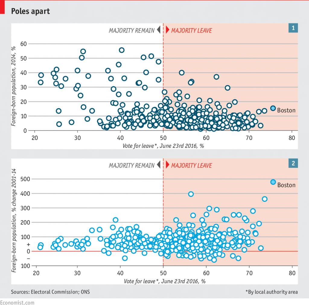
This seems to indicate that those with little exposure to immigrants have greater anti-immigration sentiments. However, this isn’t the whole story. Consider the graph below:
As The Economist explains,
Consider the percentage-change in migrant numbers, rather than the total headcount, and the opposite pattern emerges (chart 2). Where foreign-born populations increased by more than 200% between 2001 and 2014, a Leave vote followed in 94% of cases. The proportion of migrants may be relatively low in Leave strongholds such as Boston, in Lincolnshire (where 15.4% of the population are foreign-born). But it has grown precipitously in a short period of time (by 479%, in Boston’s case). High levels of immigration don’t seem to bother Britons; high rates of change do.
