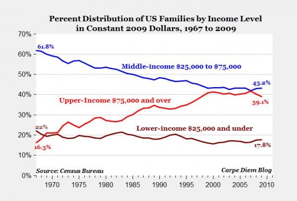
There’s been a lot of talk about the growing income inequality in the United States, and I’ve become convinced by the research that (all else being equal) more income inequality is usually a bad thing. Along with this narrative, however, there’s an assumption that as the rich get richer and richer the rest of us get poorer and poorer. But that assumes a zero-sum game, and the economy is not a zero-sum game. It also spends too much time focusing on dollars instead of on people. As the chart above shows–lifted from this piece at the conservative American Enterprise Institute–if we just pick a fixed dollar amount (like $75,000) and then ask how many households are above or below it, the result is that more and more families are moving upwards, not downwards. (And keep in mind, inflation has nothing to do with this because the chart is using inflation-adjusted dollars.)
And, yes, it’s a conservative think tank. But the data actually comes straight from the Census Bureau. I’m looking at a way to misinterpret this, and it seems pretty straightforward. In fact, it’s not necessarily even new news. A quick trip to the Internets reveals a similar piece from CNBC over a year ago: Did the ‘Lost’ Middle Class Become Upper Class? The article starts out with the typical, grim statistics about wealth being concentrated at the top (and I do believe this is a problem), but then makes the switch to asking about where people are going instead of dollars and finds lots of really good news such as:
The study shows that as the number of middle-class Americans fell (from 61 percent of the population to 51 percent of the population), the percentage of Americans who are upper income surged from 14 percent of the population to 20 percent of the population.
And then:
A majority of middle-class adults in the survey say they have a better standard of living now than their parents had at the same stage of life. A majority also say they expect their own children’s standard of living to eventually surpass their own. And many more of the middle class say they grew up in the lower-middle or lower class (40 percent) than say they grew up in the upper-middle or upper class (16 percent); 44 percent say they grew up in the middle class.
This doesn’t necessarily mean that all is right with the world. The first stat suggested that 60% of the missing middle class had moved up. The other 40% had, presumably, moved down. That’s not good, and a lot of the results are going to hinge on details like the definition of “middle class”. But that’s one more reason I like the first chart: it picks an objective standard to measure against. What’s more, it’s a particularly good standard. Why? Because research into money and happiness shows that $75,000 is about the magic number where money stops buying happiness. Below $75,000, and most people really need more to be able to reach what we consider a comfortable standard of living in our society, so money and happiness are closely linked. But once you get to $75,000 the influence of money on happiness starts to disappear because you’ve reached the amount of money required (in general, obviously not in all cases) to meet your day-to-day needs. After that, happiness is less of a hostage to money-related stress and becomes dependent on other things. (Time has just one of many, many articles about this research.)
So, when you keep that in mind, that chart is pretty good news, don’t you think?
Yes, yes it is.
As for the $75,000 cut-off, Betsey Stevenson and Justin Wolfer have a recent paper that argues the “basic needs” claim is untrue: http://www.brookings.edu/~/media/research/files/papers/2013/04/subjective%20well%20being%20income/subjective%20well%20being%20income.pdf
Here’s a brief overview with graphs to accompany it: http://www.brookings.edu/research/interactives/2013/income-well-being
And for good measure, here is a video by economist Steven Horwitz on the “poor getting poorer” and income mobility: http://learnliberty.com/content/are-poor-getting-poorer
A lot of this is driven mechanically by aging demographics: http://www.mhealthtalk.com/wp-content/uploads/2011/06/Census-Age-Distribution.jpg
Family/household income distribution over time is probably a better measure of changes in inequality.
Walker’s third link is a video that addresses family income over time. Worth watching.
Also: the argument that the reason for migration into the upper class is a result of aging is an explanation, not a refutation. Even if that is indeed the reason (or a primary driver), I think it’s still important for people to have an accurate perception.
The reason for this is that the harm from objective poverty is primarily objective: it exists whether you think of yourself as rich or poor. But the harm from relative poverty is mostly based on perception. If people believe they are significantly poorer, then they will face the negative consequences of inequality.
I remember reading about income mobility a while back, and the stats then showed that only about 25% of the bottom income earners stayed “poor” over the course of a decade. Young adults make up a large chunk of the poor and move up with education and age. And the top 20% of earners didn’t stay static over the course of life either. I know there is frustration among those who hit middle age, finally are making the top of their earning potential, are sandwiched financially between taking care of teenagers and older kids and taking care of older parents, and also experience heavier taxation and animosity on a political scale for their higher incomes. In general, middle-aged folks need their higher earning potential for their stage in life as opposed to young adults starting out in life. We all know exceptions, no doubt.
You can count my family as one who has dropped out of the middle/upper middle class in the last two years. We are definitely counted as quite poor statistically. But that is due to my husband’s grad school — similar situation to your grad school experience. It should change dramatically in the next year or so. And we don’t “feel” poor right now, which matters, as you state. We feel fortunate. I’m not sure I understand the $75,000 mark, so I will have to read more on that. I remember that was about our comfort threshold in Richmond, but I can’t imagine we would feel quite as comfortable in Denver or New York, especially with a few more kids now, although I realize it is an overall generalization.
Not a refutation, just a note that an historically high proportion of earners (and especially *married* earners) are at/near/just past peak earning potential. This is important because AEI is using family income which only measures incomes for households with two or more persons related through blood, marriage or adoption.
Using family instead of household income is problematic, then, because of income-correlated changes in marriage patterns:
http://economix.blogs.nytimes.com/2012/02/06/marriage-is-for-rich-people/
Looking at mean household income in 2011 dollars we can see pretty plainly that households in the top quintile are earning about what they did prior to the financial crisis, while all other households are stuck with mid/late 1990s earnings: http://i.imgur.com/hfyvGER.png
Of course these households are not paying mid/late 1990s medical or education prices, which only compounds their injury. And what’s EVEN worse, is that this is just income. Since the bottom 60% of the country had most of their wealth tied up in housing and automobiles, per-household/capita wealth was essentially vaporized for lower quintiles in 2008. The top quintile saw big aggregate losses thanks to having money in the market, but they’ve since reaped tremendous gains with the market’s rebound.
I watched the LearnLiberty video but I’m skeptical about the usefulness of measuring mobility via absolute change, and especially so when the measurement cuts off 20-30 years ago. Going back to the mean household income chart, it’s the post-2000 trends that are concerning, and post-2000 policies that are at the heart of the debate over inequality.
As a counterpoint, here’s a paper from the San Francsisco Fed that examines absolute and relative mobility using data from the “Panel Study of Income Dynamics (PSID), a longitudinal survey…[begun] in 1968 with a sample of 5,000 families.”: http://www.frbsf.org/economic-research/files/el2013-06.pdf
~70% of children born in the bottom quintile remain in the bottom quintile as adults. Not great! I think what we really want to see is how relative mobility has changed over time.
Another AEI study measured the absolute condition of the American poor and middle class: http://www.aei.org/files/2011/10/25/Material-Well-Being-Poor-Middle-Class.pdf
Benefits have also become a big portion of worker compensation, which is not the same as strict income.
“I watched the LearnLiberty video but I’m skeptical about the usefulness of measuring mobility via absolute change, and especially so when the measurement cuts off 20-30 years ago.”
The video has a link for data from the Treasury Dept. between 1996 and 2005 (http://www.treasury.gov/resource-center/tax-policy/Documents/incomemobilitystudy03-08revise.pdf). The key findings were:
– There is considerable income mobility of individuals in the U.S. economy over the 1996 through 2005 period. More than half of taxpayers (56 percent by one measure and 55 percent by another measure) moved to a different income quintile between 1996 and 2005. About half (58 percent by one measure and 45 percent by another measure) of those in the bottom income quintile in 1996 moved to a higher income group by 2005.
– Median incomes of taxpayers in the sample increased by 24 percent after adjusting for inflation. The real incomes of two-thirds of all taxpayers increased over this period. Further, the median incomes of those initially in the lowest income groups increased more in percentage terms than the median incomes of those in the higher income groups. The median inflation-adjusted incomes of the taxpayers who were in the very highest income groups in 1996 declined by 2005.
– The composition of the very top income groups changes dramatically over time. Less than half (40 percent or 43 percent depending on the measure) of those in the top 1 percent in 1996 were still in the top 1 percent in 2005. Only about 25 percent of the individuals in the top 1/100th percent in 1996 remained in the top 1/100th percent in 2005.
– The degree of relative income mobility among income groups over the 1996 to 2005 period is very similar to that over the prior decade (1987 to 1996). To the extent that increasing income inequality widened income gaps, this was offset by increased absolute income mobility so that relative income mobility has neither increased nor decreased over the past 20 years.
I’m interested as to why you find the measurement of absolute change less useful than relative change. I think absolute change gives a more accurate perspective myself. Notice that the Fed paper you linked to said that in absolute terms, mobility in the U.S. is quite good.
This doesn’t mean all is well. But as you noted, marriage and family life are also contributors to inequality. Stable marriage typically yields psychological and financial benefits for both the participants and their children. Broken families have huge economic, educational, and psychological impact on children.
Health benefits have grown as a share of total remuneration, but upfront health *costs* (i.e. premiums) have far outpaced inflation and wage growth during this same period. In any case, this is cold comfort for for the bottom 40% whose incomes have fallen to 1990s-era levels with no sign of the trend reversing, and who aren’t being offered benefits in the first place: http://bit.ly/1dKtuGh
(source: http://bit.ly/wULrJ1).
While it’s true that poor people (and more and more the middle class) are increasingly getting cash-only compensation, some portion of these cohorts do receive transfers in lieu of employer-sponsored benefits. You can’t eat Medicare, or use it as housing downpayment to begin building equity that you can pass on to your children, or start a small business with it, but of course there is some utility in having health insurance. CBO looked at after-tax income growth by income group: http://bit.ly/15RxJfZ
http://1.usa.gov/Ovs2e9
So, with a real GDP increase of 150% over 30 years, workers in the bottom 20th saw an after-tax income increase of just 18%. For the 60% of workers in the middle quintiles, it was less than 40%. For the upper 20th (less the 1%) it was around 50%. The 1% saw a whopping 275% increase until the 2008 financial crisis temporarily reversed some of this growth.
I’m less concerned with income inequality in and of itself, and more concerned with equality of opportunity. In a Rawlsian sense, changes over time in relative intergenerational mobility among and within top, middle and bottom earning cohorts is most helpful in determining whether our society is becoming more or less just. Besides, absolute intergenerational increases are a given bare minimum of capitalism. There wouldn’t be much point to the whole thing otherwise…..
Also, inequality and declining marriage rates are a two way street. It’s a rational economic choice for a woman with child(ren) to jettison a male that has diminished job prospects and is looking at a lifetime of flat or decreasing wages. And that’s another thing: relative longitudinal change (comparing to one’s parents, peers, or self) can better account for the effects of structural workforce changes like women entering the workforce and men, increasingly of late, dropping out.
Scott Winship at the Brookings Institution on the middle class and men’s “declining” wages: http://www.brookings.edu/research/articles/2013/07/01-mens-rising-earnings
Another great reason why relative mobility is so important in examining “the American Dream” vis a vis intra-income/generational mobility. Absolute change in the lowest two-fifths has been increasingly shaped by undergrad-PHD students who have low incomes for 4-10 years and then jump to the next quintile (or more) once they get their first “real” job. This cohort and its income trends are separate and apart from workers who aren’t in school.
http://upload.wikimedia.org/wikipedia/en/d/d1/Educational_Attainment_in_the_United_States_2009.png
The cited papers in the Brookings paper are rebutting pre-tax statistics. See after-tax CBO figures I provided above.
“So, with a real GDP increase of 150% over 30 years, workers in the bottom 20th saw an after-tax income increase of just 18%. For the 60% of workers in the middle quintiles, it was less than 40%. For the upper 20th (less the 1%) it was around 50%. The 1% saw a whopping 275% increase until the 2008 financial crisis temporarily reversed some of this growth.”
So, in other words, there has been an after-tax income increase across the board over the past several decades. Not to mention that these various quintiles are made up of different people at different times.
Not a point that’s really in contention. An absolute across the board after-tax income increase over 30 years is kind of a boring given. It’s the trend of divergence, and question of whether the trend represents outsized capture of (a growing) pie, that are the issues: http://knowledgecenter.csg.org/drupal/system/files/Mean_v_Median_CBO.PNG
“Not a point that’s really in contention. An absolute across the board after-tax income increase over 30 years is kind of a boring given.”
Fair enough. Although I would argue it is often a point of contention when it really shouldn’t be. At the very least it seems to me that this “boring given” is often ignored and replaced with an unnecessary pessimism.
I personally find the absolute change in the human condition that has taken place over the past several decades to be quite exciting, especially on a global scale. I think the absolute change must be the foundational paradigm when approaching the relative change. Otherwise, we might ignore what makes the absolute change (and its general permanence) possible.
I’m actually quite optimistic about global progress:
http://theslowhunch.blogspot.com/2012/11/hell-in-handbasket.html
http://theslowhunch.blogspot.com/2013/06/its-getting-better.html
A good point. Certainly you want to keep aware of absolute change and keep it in mind when looking at the big picture. A lot of people DO lose sight of this which leads to all manner of erroneous conclusions.
I share your aversion to pessimism and your predilection for optimism! This piece is similar to the links you posted below. It’s more directed at investors but applies to anyone who bothers to follow the news or think about public policy, economics, etc…
“Housel noted what has occurred over the past 150 year or so. If you allowed the headlines to drive your investments, how would you respond to these events:
• 1.3 million Americans died while fighting nine major wars.
• Four U.S. presidents were assassinated.
• 675,000 Americans died in a single year from a flu pandemic.
• 30 separate natural disasters killed at least 400 Americans each
• 33 recessions lasted a cumulative 48 years.
• The stock market fell more than 10% from a recent high at least 97 times.
• Stocks lost a third of their value at least 12 times.
• Annual inflation exceeded 7% in 20 separate years.
• The words “economic pessimism” appeared in newspapers at least 29,000 times, according to Google.
And despite these horrific headline events, our standard of living increased 20X.”
http://www.ritholtz.com/blog/2013/06/a-permanent-optimist/