The Economic Impact of Immigration: UK Edition

Image result for brexit

Economist Jonathan Portes has an excellent summary of the research on immigration’s effects in the UK:

  • Employment: “To the considerable surprise of many economists, including me, there is now a clear consensus that even in the short-term migration does not appear to have had a negative impact on the employment outcomes of UK natives. Studies have generally failed to find any significant association between migration flows and changes in employment or unemployment for natives (see, for example, BIS 2014 for a review).  Since 2014, the continued buoyant performance of the UK labour market has further reinforced this consensus. Rapid falls in unemployment, now down to just over 4%, have been combined with sustained high levels of immigration. Nor is there any evidence that immigration has impacted the employment prospects of specific groups such as the young or unskilled. Crudely, immigrants are not taking our jobs – the lump of labour fallacy, that the number of jobs or vacancies in the economy is fixed (which generally refers to the medium to long term) turns out to be a fallacy in the short term as well.”
  • Wages: “While the evidence on wage impacts is less conclusive, the emerging consensus is that recent migration has had little or no impact overall, but possibly some, small, negative impact on low-skilled workers. Dustmann et al. (2013), using UK LFS data for the period 1997-2005, find that immigration put a downward pressure on the wages at the bottom of the distribution (below the 20th percentile), while the effect on the rest of the distribution (in particular above 40th percentile) is positive. Their estimates show that a 1% increase in the foreign-born/native population ratio leads to an increase of between 0.1% and 0.3% in average wages.”
  • Productivity: “Immigrants’ skills may complement those of natives.  A number of papers support this hypothesis: for example, Barone and Moretti (2011) found that low-skilled migration increased the labour force participation of highly skilled native women; Peri and Sparber (2009) and Foged and Peri (2016) found that low-skilled migration increased the wages of native low skilled workers.  In particular, they argue that natives may have a comparative advantage in jobs with more communication-intensive tasks with respect to foreign workers, and that immigration ‘pushes’ low-skilled natives to occupations with a higher intensity of such skills, increasing the level of specialisation in the economy and hence productivity, as signalled by the corresponding increase in wages. Immigration might also influence the level of human capital in the economy, either directly if immigrants have high educational attainment (Kerr and Lincoln 2010, Hunt and Gauthier-Loiselle 2010), or indirectly by increasing the incentive on natives to acquire human capital. Some evidence (Hunt 2017, McHenry 2015) suggests that increased low-skilled immigration increase school performance and outcomes for US natives…Looking at the service sector, Ottaviano et al. (2015) show that a 1% increase in immigrants’ concentration in local labour markets is associated with a 2% to 3% rise in labour productivity, measured as gross value added per worker, mainly as a result of the cost-cutting dynamics implied by immigration-induced labour supply shocks. In addition, immigration represents a substitute for the import of intermediate inputs and is associated with an increase in exports to immigrants’ countries of origin.   Rolfe et al. (2013) found that immigrants concentration within specific industries was associated with slight increases in productivity, but the impact was small. At the aggregate level, recent literature uses cross-country evidence to estimate the impact of migration on growth and productivity in advanced economies. Boubtane et al. (2015) find that migration in general boosts productivity in advanced economies, but by varying amounts; for the UK, the estimated impact is that a 1 percentage point in the migrant share of the working age population leads to a 0.4-0.5% increase in productivity. This is higher than in most other advanced economies and reflects the relatively high skill levels of migrants to the UK. Jaumotte et al. (2016) find that a 1% increase in the migrant share of the adult population results in an increase in GDP per capita and productivity of approximately 2%. This result is consistent across a variety of empirical specifications.  Perhaps surprisingly, the estimated aggregate impacts of high and low skilled migration are not significantly different (although the distributional implications are very different). In a within-country perspective, Peri (2012), with a state-based analysis in US, finds that a 1% increase in immigration raises total factor productivity by 0.5%, mainly thanks to increased specialisation induced by immigrants’ inflows.”
  • Fiscal: “Dustmann and Frattini (2014) found that recent migrants, especially those from the EU, had a more positive fiscal impact on average than natives.  Of course, it is hardly surprising that young migrants in employment make an initial positive fiscal contribution; proper assessment of fiscal impacts requires a life-cycle perspective (Preston 2014).   In this context, there are various reasons to expect the impact to still be positive (in particular, migrants tend to arrive after they have left compulsory, publicly financed education). However, a positive net impact on public finances at the national level does not preclude a significant impact on demand (and hence cost) at the local level, particularly if funding allocations do not adjust quickly (or at all) to reflect pressures resulting from migration (George et al. 2011). A notable recent example is the shortage of primary school places in some parts of the UK (especially London); this appears to be largely the result of poor planning on the part of central government, given the rise in the number of young children resulting from recent increases in migration (from both the EU and elsewhere). But broader concerns about the potential negative impacts on public services appear to be largely unsubstantiated: higher immigration are not associated, at a local level, with longer NHS waiting times (Giuntella et al. 2015); and in schools, increased numbers of pupils with English as a second language doesn’t have any negative impact on levels of achievement for native English speaking students (Geay et al. 2013). If anything, pupils in schools with lots of non-native speakers do slightly better.”
  • Prices: “Frattini (2008) analyses the impact on tradable, non-tradable goods and services prices across UK regions over the period 1995-2006 and shows that immigration is associated with a fall in prices for non-tradeable goods and services, but a rise in the price of tradeables.  Sá (2015) focuses on the impact on housing prices in UK local authorities from 2003 to 2010 and shows that immigration actually reduces house prices at a local level, since natives leave the area in response to high immigrant inflows; although this does not imply, of course, that immigration does not overall exert upward pressure on house prices at a national level.”

So what are the likely results of Brexit? He concludes,

The conclusion is that the reductions in migration resulting from Brexit are likely to have a significant adverse impact on UK productivity and GDP per capita. The broad scenarios (not forecasts) we depict imply that the negative impacts on per capita GDP will be significant, potentially approaching those resulting from reduced trade.  By contrast, the increase in low-skilled wages resulting from reduced migration is expected to be, if at all, relatively modest.

Simonian Economics

Image result for julian simon

A few years ago, I had a post about the Simon-Ehrlich wager in which economist Julian Simon won his bet against professional fearmonger Paul Ehrlich (who still won’t shut up). The evidence continues to mount that Simon was correct. Recently GMU economist Bryan Caplan reported on his own Simonian bet with Tyler Cowen and David Balan. “In July of 2008,” he writes, “the average U.S. price of regular gasoline was $4.062.” He bet “$100, even odds, that the U.S. price of gas (including taxes) in the first week of January, 2018 will be $3.00 or less in 2008 dollars.”

A subsequent clarification specified that the bet was on the price of regular gasoline.

Today, the January CPI arrived, allowing us to finally resolve this ten-year bet.  In 2008, the US CPI stood at 215.3.  In the third quarter of 2017, it hit 244.7.  Since then, there has been further inflation of 0.3%, bringing us to 245.3, for a grand total of 13.9% inflation during this period.  For me to win, then, the average price of regular gasoline in January 2017 must be less than $3.417.

So where are we now?  In January of 2018, the average price was a mere $2.555.  I have therefore won this bet by a margin of over 25%.  (Indeed, even if we count all gasoline, the average price is only $2.671).  I would have prevailed if there’d been 0% inflation – or as much as 14% cumulative deflation.

…For as long as we’ve had data, gas prices have shown frequent spikes, followed by gradual declines back to long-run trend.  So when prices spiked to over $4.00, I expected the past to repeat itself.  And repeat itself it did.

I expect that Tyler will insist that I just got lucky.  And if I lost roughly half my bets, that would be a wise reaction.  However, this latest victory brings my betting record to 17 wins and 0 losses.  Yes, pride goeth before the fall.  There’s at least one outstanding bet that I now expect to lose.  Still, the only reasonable explanation for my 17-and-0 record is that my judgment is exceptionally good.

As always, my opponents have my respect – and deserve yours.  They stuck out their necks and made clear claims.  If every pundit would do the same, this would be a far better – and far quieter – world.

Does an Increase in the Minimum Wage Decrease Teen Employment?

Image result for teenagers unemployed

Yes, according to previous research and according to a new working paper out of GMU’s Mercatus Center.[ref]Which has published other good work on the effects of the minimum wage.[/ref] The authors report,

First, we sought to understand the sources of the decline in teen employment that began around 2000—in particular, the decline in employment among those age 16–17—as well as, more generally, changes in teen employment and school enrollment behavior. Second, we wanted to explore the implications of these changes for human capital, given that the decline in employment consisted of fewer teens in school and employed, and more teens in school exclusively, suggesting a greater focus on schooling. We have considered three explanatory factors: (1) a rising minimum wage that could reduce employment opportunities for teens and potentially also increase the value of investing in schooling; (2) rising returns to schooling; and (3) increasing competition from immigrants that, like the minimum wage, could reduce employment opportunities but also raise the returns to human capital investment. 

With respect to the first question, we find some evidence of the expected effects of all three explanatory factors on teen employment and school enrollment—and in particular for those age 16–17. However, in terms of explaining changes in the behavior of teens age 16–17 since 2000, the role of the minimum wage is predominant. Increases in the returns to schooling appear to have played almost no role, and immigrant competition a minor role. In contrast, our simulation results suggest that minimum wages explain about a quarter of the shift, since 2000, from being simultaneously employed and enrolled in school to being exclusively enrolled in school.

Turning to the second question, our examination of the longer-term effects of these three factors uncovers no evidence that higher minimum wages, which underlie teens shifting from combining work and schooling to being in school exclusively, led to greater human capital investment. If anything, the evidence is in the other direction. Thus, it is more likely that the principal effect of higher minimum wages in the 2000s, in terms of human capital, was to reduce employment opportunities that could enhance labor market experience. Further, we find no evidence of net-positive human capital effects of rising returns to schooling or increased immigration in this period, even though these latter two factors—more so immigration—played at least a minor role in the changes in teen employment and school enrollment.

Based on this evidence, then, it appears that the changes in teen labor market and schooling behavior since 2000—stemming in part from adverse effects of minimum wages on employment opportunities, and to a lesser extent from immigration—did not reflect greater human capital investment that would raise future earnings. It is not clear that immigration delivered any other short-term benefits to teens. In contrast, some teens surely benefited directly in the short run from higher minimum wages. But there appear to have been either no effects or adverse effects on longer-run earnings for those exposed to these higher minimum wages as teenagers (pgs. 47-48).

Does Government Stimulus Actually Stimulate?

Image result for government spendingIn an interview in the Regional Economist, St. Louis Fed Assistant Vice President Bill Dupor lays out the competing views of economists:

According to one view, purchases by the government cause a chain reaction of spending. That is, when the government buys $1 worth of goods and services, people who receive that $1 will save some of the money and spend the rest, and so on. This theory suggests that the “government spending multiplier” is greater than 1, meaning that the government’s spending of $1 leads to an increase in gross domestic product (GDP) of more than $1.

The other view suggests that government spending may “crowd out” economic activity in the private sector. For example, government spending might be used to hire workers who would otherwise be employed in the private sector. As another example, if the government pays for its purchases by issuing debt, that debt could lead to a reduction in private investment (due to an increase in interest rates). In this case, the $1 increase in government spending leads to an increase in GDP of less than $1 because of the decline in private investment. Therefore, the government spending multiplier is less than 1.

His own research

examined the impact of defense spending on the U.S. economy in the post-World War II period. Our results suggest that the multiplier is less than 1, meaning that the government spending causes some crowding out of private economic activity. In particular, we found that an additional $1 in defense spending leads to a reduction of about 50 cents from some other part of the economy.

He also “studied the effects of the American Recovery and Reinvestment Act of 2009, with a primary focus on employment. My general finding is that the government was able to create jobs but at a fairly expensive cost. For example, in one study I worked on, I found that creating a job lasting one year cost the government about $100,000, whereas the median compensation for a U.S. worker was roughly $40,000.” In short, “government spending does not seem to be a very cost-effective way to stimulate the economy and create jobs. However, economists have a lot more to learn on this topic.”

Doing Business 2018

The World Bank’s latest Doing Business report is out (check out last year’s). The report “measures regulations affecting 11 areas of the life of a business. Ten of these areas are included in this year’s ranking on the ease of doing business: starting a business, dealing with construction permits, getting electricity, registering property, getting credit, protecting minority investors, paying taxes, trading across borders, enforcing contracts and resolving insolvency. Doing Business also measures labor market regulation, which is not included in this year’s ranking.”

Its main findings:

  • Brunei Darussalam, Thailand, Malawi, Kosovo, India, Uzbekistan, Zambia, NigeriaDjibouti and El Salvador were the most improved economies in 2016/17 in areas tracked by Doing Business. Together, these 10 top improvers implemented 53 regulatory reforms making it easier to do business.
  • Economies in all regions are implementing reforms easing the process of doing business, but Europe and Central Asia continues to be the region with the highest share of economies implementing at least one reform—79% of economies in the region have implemented at least one business regulatory reform, followed by South Asia and Sub-Saharan Africa.
  • The report features four case studies in the areas of starting a business, dealing with construction permits, registering property and resolving insolvency, as well as an annex on labor market regulation. See all case studies.

The report finds that

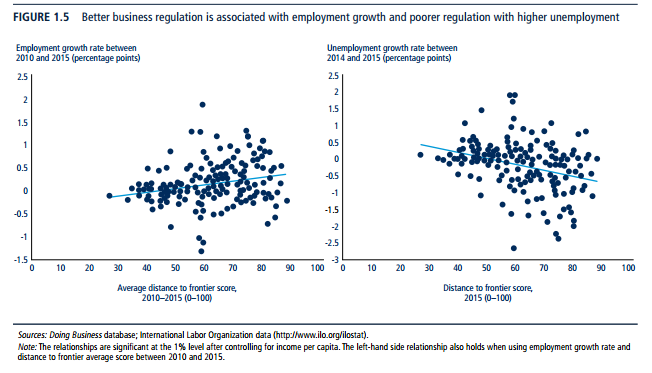
one of the mechanisms through which business regulation can impact employment directly is the simplification of business start-up regulations. Across economies there is a significant positive association between employment growth and the distance to frontier score (figure 1.5).[ref]”Doing Business measures many different dimensions of business regulation. To combine measures with different units such as the number of days to obtain a construction permit and the number of procedures to start a business into a single score, Doing Business computes the distance to frontier score. The distance to frontier score captures the gap between an economy’s current performance and the best practice across the entire sample of 41 indicators across 10 Doing Business indicator sets. For example, according to the Doing Business database across all economies and over time, the least time to start a business is 0.5 days while in the worst 5% of cases it takes more than 100 days to incorporate a company. Half a day is, therefore, considered the frontier of best performance, while 100 days is the worst. Higher distance to frontier scores show absolute better ease of doing business (as the frontier is set at 100 percentage points), while lower scores show absolute poorer ease of doing business (the worst performance is set at 0 percentage points). The percentage point distance to frontier scores of an economy on different indicators are averaged to obtain an overall distance to frontier score” (pg. 5).[/ref]While this result shows an association, and cannot be interpreted in a causal fashion, it is reassuring to see that economies with better business regulation, as measured by Doing Business, also tend to be the economies that are creating more job opportunities. When it comes to unemployment, the expected opposite result is evident. Economies with less streamlined business regulation are those with higher levels of unemployment on average. In fact, a one-point improvement in the distance to frontier score is associated with a 0.02 percentage point decline in unemployment growth rate.

…The data support this interpretation as there is a strong association between inequality, poverty and business regulation. In fact, economies with better business regulation have lower levels of poverty on average. Indeed, a 10 percentage point improvement in the distance to frontier is associated with a 2 percentage point reduction in the poverty rate, measured as the percentage of people earning less than $1.90 a day. Fragility is also a factor linked to poverty. However, even fragile economies can improve in areas that ultimately reduce poverty levels (pg. 7-8).

Check out the full report.

Does Family Structure Really Matter When It Comes to Poverty?

Image result for single mother

Not according to a recent op-ed in The New York Times. The authors–sociologists all–argue based on findings from their new study[ref]Working paper version here.[/ref]

that reducing single motherhood would not substantially reduce poverty. Single-mother families are a surprisingly small share of our population. Among households headed by working-age adults, 8.8 percent of people lived in single-mother households in 2013 — the most recent year we were able to analyze. The share of people in single-mother households actually declined from 10.5 percent in 1980 and has increased only modestly since 18=970, when it was 7.4 percent. True, compared with other rich democracies, America does have a relatively high portion of families headed by single mothers. Nevertheless, we still fall below Ireland and Britain and are quite similar to Australia and Iceland.

Because fewer people are in single-mother families than you’d think, even large reductions in single motherhood would not substantially reduce poverty. 

However, sociologist W. Bradford Wilcox takes issue with the way the NYT piece presents the evidence. He explains,

Nobody…is claiming that reducing the number of single-mother households will lead to lower poverty rates among elderly or childless men and women. The concern among poverty scholars has always been that single motherhood leads to higher rates of child poverty. And there is no denying the close connection between single parenthood and child poverty in America.

To begin with, children living in single-mother families are about five times as likely to be poor, compared with children living in married, two-parent families. This is clear in a recent analysis of trends in the official poverty rate from our colleague Ron Haskins at the Brookings Institution.

Moreover, research done by one of us, Isabel Sawhill, indicates that if the share of children in single-parent families had remained steady at the 1970 level, then the current child-poverty rate would be cut by about one-fifth, even after adjusting for the fact that single mother have different characteristics from married mothers. In other words, dramatic increases in single parenthood — from about 12 percent of children in 1970 to about 27 percent now — more recently have played an important role in fueling child-poverty rates.

Single parenthood is not the factor driving child poverty in America, but it isa factor.

What about Europe?

Well, it turns out that even in Europe children are more likely to be poor if they are living in a family headed by a single parent. Research done by social scientists Janet Gornick and Markus Jäntti indicates that children being raised by a single parent are about three times as likely to be living in a poor family as children being raised by two parents, even after accounting for generous welfare policies in Europe.

In fact, this is true even in Scandinavia. Relative to children in two-parent families, children in single-mother homes are about three times as likely to be poor in Denmark and Sweden, more than four times as likely to be poor in Norway, and nearly five times as likely to be poor in Finland, after taking into account their welfare policies.

Now, it’s true that the levels of child poverty in Scandinavia are markedly lower than those in the United States — indeed, about 75 percent lower because of their social policies. And it’s also true that the unique poverty risk associated with single parenthood generally goes away when you control for other factors, such as age, education, and employment, as Brady and his colleagues have done. What that misses is that mother-headed families are more likely to be formed as the result of an unplanned birth outside of marriage or a committed relationship, and that these unexpected births tend to occur at young ages, to interrupt a young woman’s education, and to make it less likely that she will ever marry or form a stable partnership and have the second income that such a partnership makes possible.

In other words, even today, one reason that two parents are generally better than one parent, economically speaking, is that having two parents in the home dramatically increases the odds not only that at least one parent is working full-time but also that there are two parents working on behalf of the children. And this is true even in Europe.

What’s more,

The social science tells us that children raised by single parents are significantly more likely to have children young, to drop out of high school, and to work less as young adults. Not surprisingly, the children of single-parent families are more likely to end up poor as young adults.

…Indeed, new research from economists Melissa Kearney and Phillip Levine indicates that young adults are at least ten percentage points less likely to be poor at age 25 if they were born to married parents, as opposed to an unmarried mother. These effects are especially strong for children born to mothers in the middle of the educational and age distribution — that is, for “children of mothers with high school degrees and mothers in their early/mid-20s.” In other words, in America at least, the long arm of single parenthood seems to extend into adulthood, increasing the likelihood that children of single parents will be poor as adults, compared with adults who were raised in intact, two-parent families.

Wilcox concludes, “It’s useful to point out that family structure is not destiny. But the evidence suggests it remains important and shouldn’t be dismissed as one important factor affecting children in particular.”


Look How Far We’ve Come

Oxford’s Max Roser has provided a much-needed ray of sunshine given the past week’s events. Roser writes,

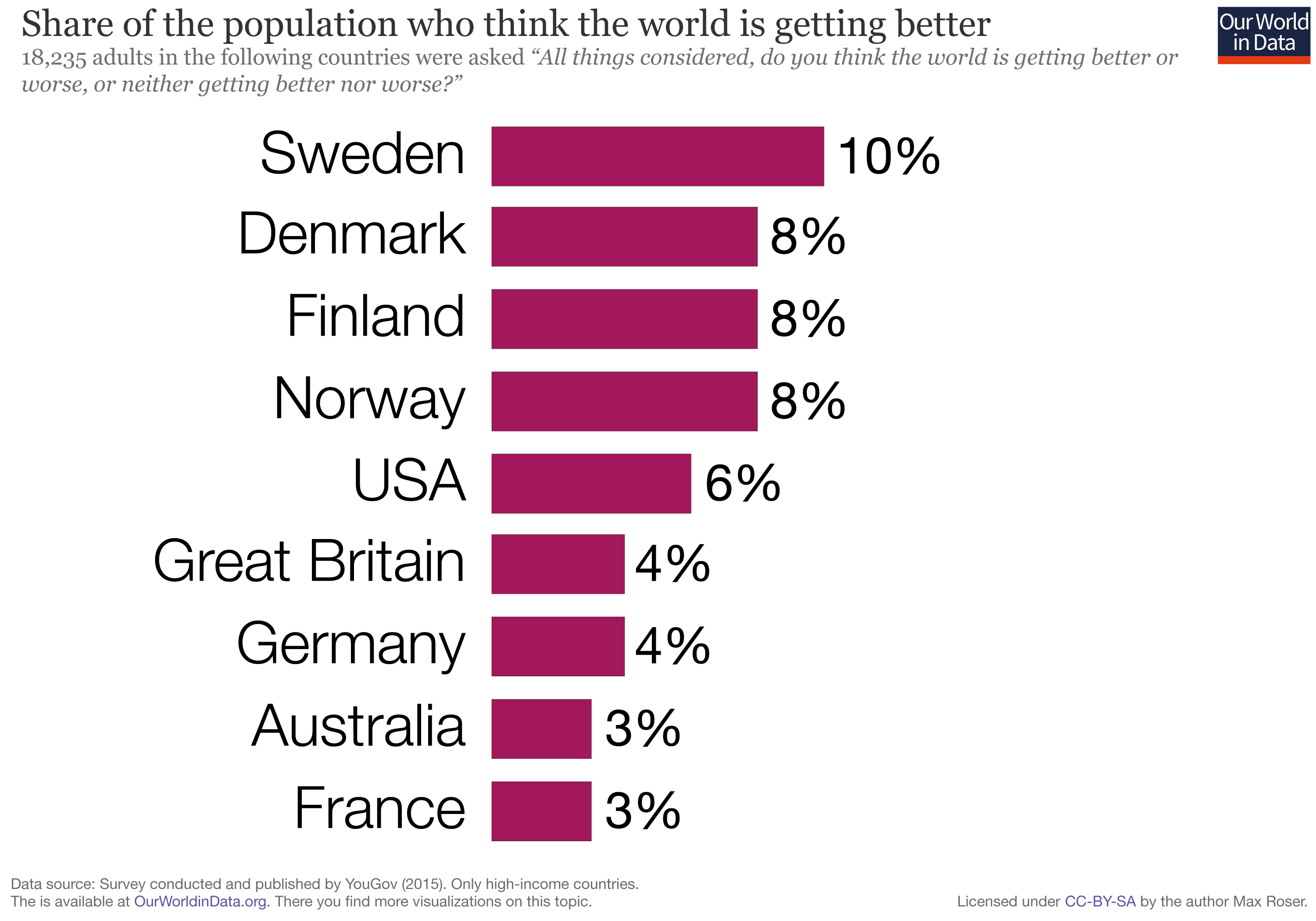
A recent survey asked “All things considered, do you think the world is getting better or worse, or neither getting better nor worse?”. In Sweden 10% thought things are getting better, in the US they were only 6%, and in Germany only 4%. Very few people think that the world is getting better.

What is the evidence that we need to consider when answering this question? The question is about how the world has changed and so we must take a historical perspective. And the question is about the world as a whole and the answer must therefore consider everybody. The answer must consider the history of global living conditions – a history of everyone.

Roser tackles several issues, but I’ve selected just four:

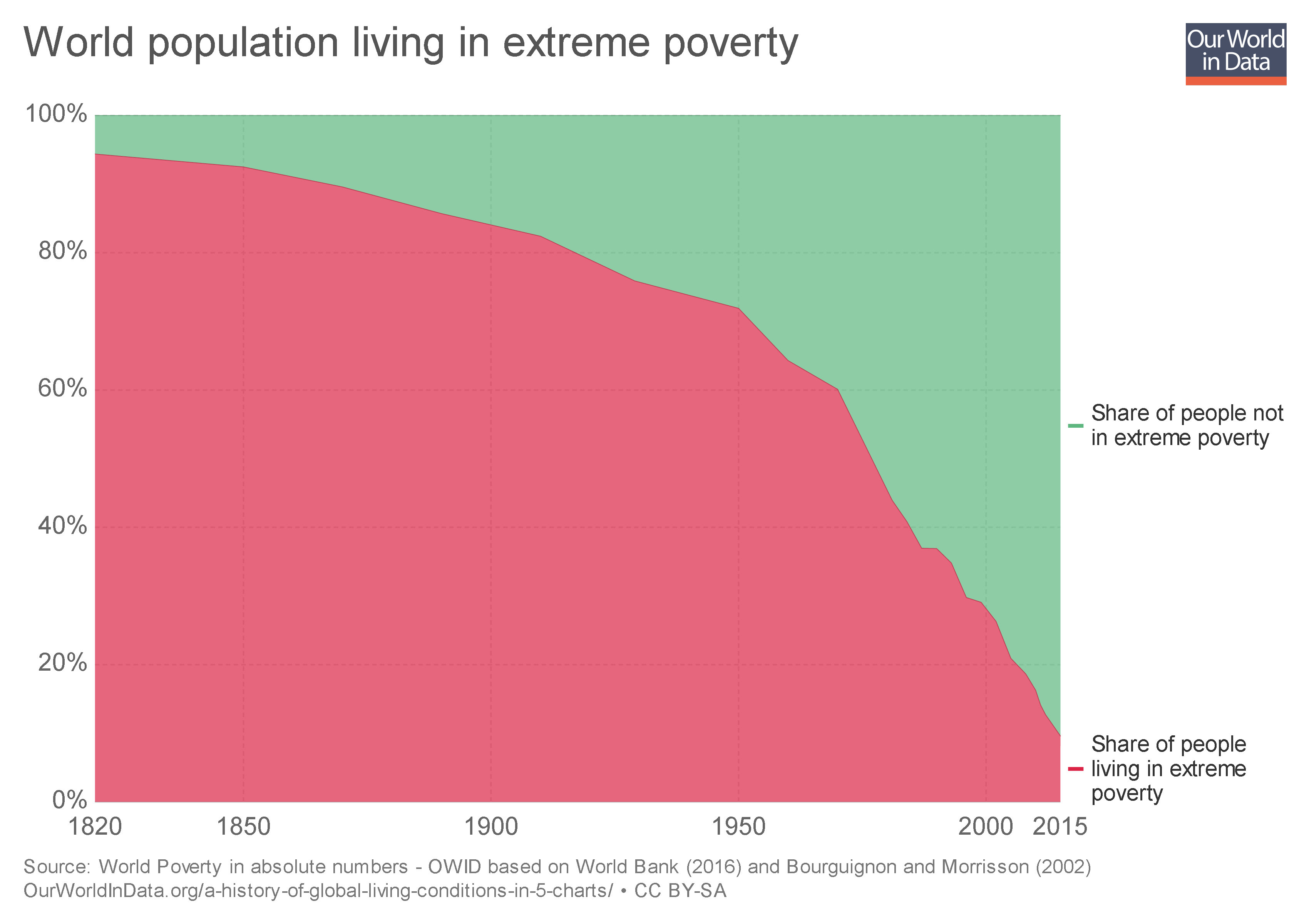
  • Poverty: “Take a longer perspective and it becomes very clear that the world is not static at all. The countries that are rich today were very poor just very recently and were in fact worse off than the poor countries today. To avoid portraying the world in a static way – the North always much richer than the South – we have to start 200 years ago before the time when living conditions really changed dramatically…The first chart shows the estimates for the share of the world population living in extreme poverty. In 1820 only a tiny elite enjoyed higher standards of living, while the vast majority of people lived in conditions that we would call extreme poverty today. Since then the share of extremely poor people fell continuously. More and more world regions industrialised and thereby increased productivity which made it possible to lift more people out of poverty: In 1950 three-quarters of the world were living in extreme poverty; in 1981 it was still 44%. For last year research suggests that the share in extreme poverty has fallen below 10%.”

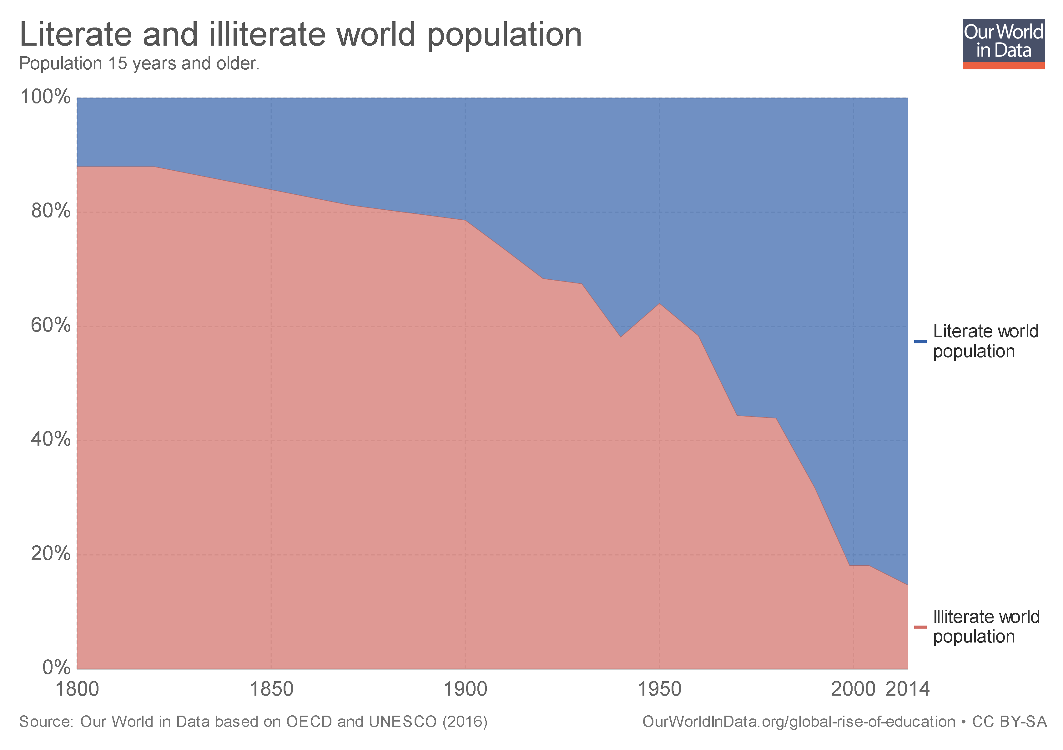
  • Literacy: “How did the education of the world population change over this period? The chart below shows the share of the world population that is literate over the last 2 centuries. In the past only a tiny elite was able to read and write. Today’s education – including in today’s richest countries – is again a very recent achievement. It was in the last two centuries that literacy became the norm for the entire population.”

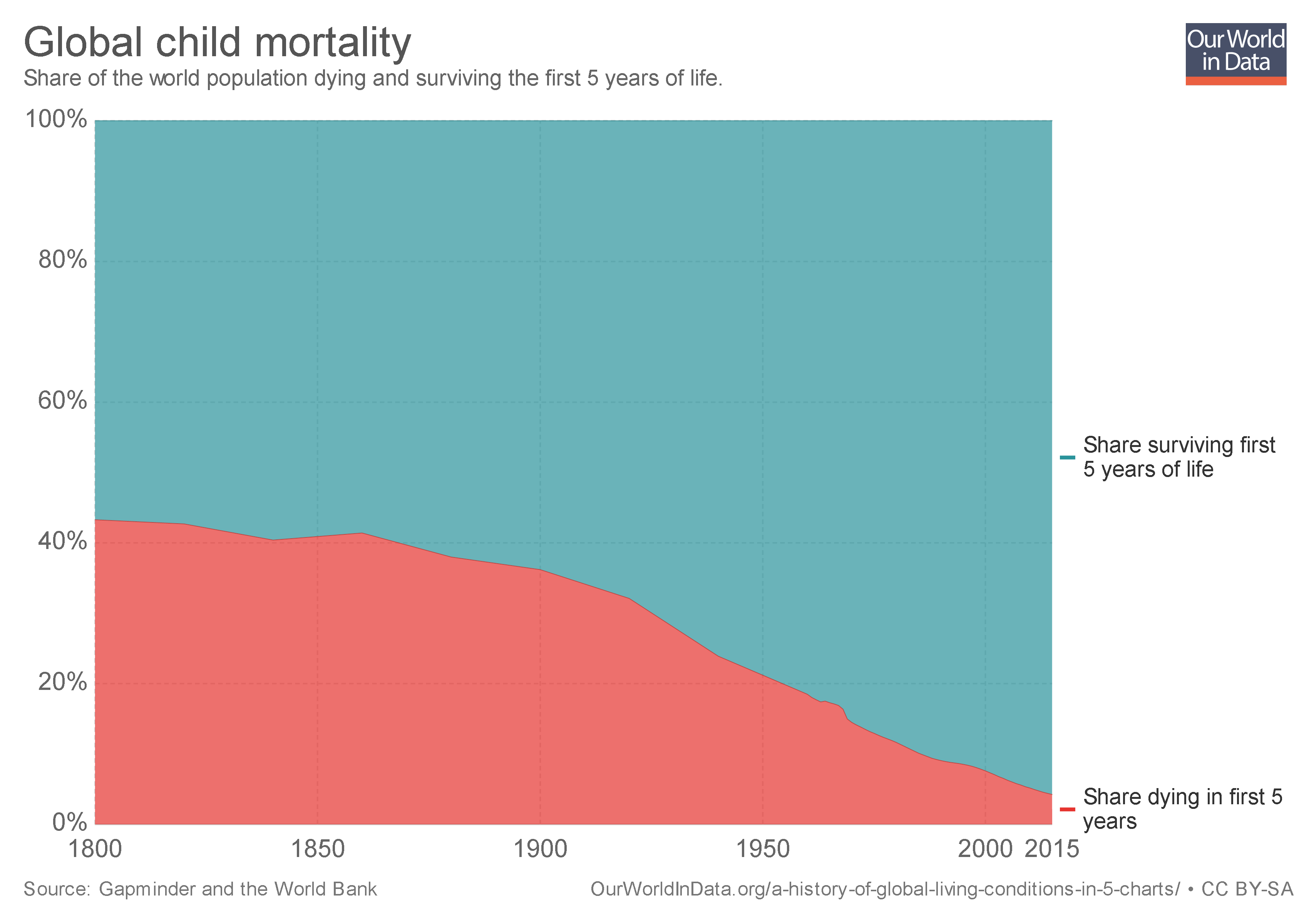
  • Health: “In 1800 the health conditions of our ancestors were such that around 43% of the world’s newborns died before their 5th birthday. The historical estimates suggest that the entire world lived in poor conditions; there was relatively little variation between different regions, in all countries of the world more than every third child died before it was 5 years old…In 2015 child mortality was down to 4.3% – 10-fold lower than 2 centuries ago. You have to take this long perspective to see the progress that we have achieved.”

  • Freedom: “Political freedom and civil liberties are at the very heart of development – as they are both a means for development and an end of development…The chart shows the share of people living under different types of political regimes over the last 2 centuries. Throughout the 19th century more than a third of the population lived in colonial regimes and almost everyone else lived in autocratically ruled countries. The first expansion of political freedom from the late 19th century onward was crushed by the rise of authoritarian regimes that in many countries took their place in the time leading up to the Second World War. In the second half of the 20th century the world has changed significantly: Colonial empires ended, and more and more countries turned democratic: The share of the world population living in democracies increased continuously – particularly important was the breakdown of the Soviet Union which allowed more countries to democratise. Now more than every second person in the world lives in a democracy. The huge majority of those living in an autocracy – 4 out of 5 – live in one autocratic country: China. Human rights are similarly difficult to measure consistently over time and across time. The best empirical datashow that after a time of stagnation human right protection improved globally over the last 3 decades.”

Roser concludes,

For our history to be a source of encouragement we have to know our history. The story that we tell ourselves about our history and our time matters. Because our hopes and efforts for building a better future are inextricably linked to our perception of the past it is important to understand and communicate the global development up to now. A positive lookout on the efforts of ourselves and our fellow humans is a vital condition to the fruitfulness of our endeavors. Knowing that we have come a long way in improving living conditions and the notion that our work is worthwhile is to us all what self-respect is to individuals. It is a necessary condition for self-improvement.

Freedom is impossible without faith in free people. And if we are not aware of our history and falsely believe the opposite of what is true we risk losing faith in each other.

Image result for look around at how lucky we are to be alive gif

Should government food assistance programs have nutritional requirements?

Some of the foods you can purchase through WIC.
Probably.

There’s good reason to believe that adding nutritional requirements to government food programs is a better use of money and leads to better health outcomes for the people in said programs.

WIC (Women, Infants, and Children) is a state-run program that helps low-income women and children purchase healthy food. WIC has specific guidelines for the quantities and types of food recipients can purchase, all of which have to meet certain health standards. In this program there is no way to purchase soda, candy, pizza, baked sweets, ice cream, etc. SNAP (Supplemental Nutrition Assistance Program, often referred to as “food stamps”) is a federally-funded program helping low-income people purchase almost any food.

The USDA explains that SNAP is for purchasing any food or food product for home consumption and that this definition includes “soft drinks, candy, cookies, snack crackers, and ice cream” and similar items. Data suggest these types of purchases make up at least 17% of SNAP spending .[ref]To get this number I added the percentages for the following categories: soft drinks, candy – packaged, frozen pizza, ice cream ice milk & sherberts, cookies, cakes, bacon, baked sweet goods, candy – checklane, sweet goods, ramen, frozen desserts, popcorn, dry mix desserts, pies, cookie/cracker multi packs, cocoa mixes, sweet goods & snacks, salty snacks, refrigerated desserts, single serve sweet goods, single serve cookie/cracker, and cake decor. There were many other categories that could arguably be categorized as unhealthy food or “junk food,” but if they were debatable I left them out.[/ref] In 2017, about 42 million people used SNAP at an average of $125.79 per person per month, meaning the government spent about $11.3 billion that year buying junk food for low-income people. What are the arguments for spending so much on junk rather than using those funds to ensure low-income people have high quality food?

Opponents of SNAP nutritional requirements give many reasons for why nutritional requirements are not feasible or effective: we can’t come up with clear standards for what is “healthy,” it would be too complicated and costly to implement such standards, restrictions wouldn’t stop people from buying unhealthy food with their own money, and people in higher income brackets purchase similar amounts of unhealthy food.[ref]Whether this last argument is true or not is a bit tangential. Research shows lower SES people have poorer nutrition and health outcomes than people with higher income. Improving nutrition is one (important) approach to bridging that gap.[/ref]

Yet WIC has managed to define what constitutes healthy food and implement a program based on those boundaries. In fact the USDA describes WIC as “one of the nation’s most successful and cost-effective nutrition intervention programs.” There is evidence to suggest people participating in WIC (especially children) have better nutrition and health outcomes than their peers. Conversely, there is evidence to suggest people who receive SNAP benefits have worse nutrition than income-eligible people who don’t participate in SNAP. For example:

Changing WIC changes what children eat – May 2013

Comparing July to December in 2008 and 2011, increases were observed in breastfeeding initiation (72.2-77.5%); delaying introduction of solid foods until after 4 months of age (90.1-93.8%); daily fruit (87.0-91.6%), vegetable (78.1-80.8%), and whole grain consumption (59.0-64.4%) by children aged 1-4 years; and switches from whole milk to low-/nonfat milk by children aged 2-4 years (66.4-69.4%). In 1-year-old children, the proportion ≥95th percentile weight-for-recumbent length decreased from 15.1 to 14.2%; the proportion of children 2- to 4-year-old with body mass index (BMI) ≥95th percentile decreased from 14.6 to 14.2%.

Trends in Obesity Among Participants Aged 2–4 Years in the Special Supplemental Nutrition Program for Women, Infants, and Children – November 2016

The prevalence of obesity among young children from low-income families participating in WIC in U.S. states and territories was 14.5% in 2014. This estimate was higher than the national estimate (8.9%) among all U.S. children in a slightly different age group (2–5 years) based on data from the 2011–2014 National Health and Nutrition Examination Survey (7). Since 2010, statistically significant downward trends in obesity prevalence among WIC young children have been observed overall, in all five racial/ethnic groups, and in 34 of the 56 WIC state agencies, suggesting that prevention initiatives are making progress, potentially by impacting the estimated excess of calories eaten versus energy expended for this vulnerable group (8).

The Supplemental Nutrition Assistance Program – September 2015

Child SNAP recipients consume more sugary beverages, processed meats, and high-fat dairy products, but fewer nuts, seeds, and legumes than income-eligible nonparticipants. Similarly, adult SNAP recipients consume more fruit juice, potatoes, red meat, and sugary beverages, but fewer whole grains than income-eligible nonparticipants. In another study, SNAP participants had lower dietary quality scores overall, and consumed significantly fewer fruits, vegetables, seafood, and plant proteins, but significantly more added sugar than income-eligible nonparticipants.

The study specifically compares SNAP nutrition to WIC nutrition:

In one study comparing the grocery store purchases of SNAP and WIC households in New England, SNAP households purchased more than double the amount of sugary beverages per month (399 ounces) than WIC households (169 ounces), 72% of which were paid for with SNAP dollars. In a 3-month study, new SNAP participants significantly increased their consumption of refined grains compared with low-income people who did not join. In a study of Hispanic Texan women, SNAP participants consumed 26% more sugary beverages and 38% more sweets and desserts than low-income nonparticipants.

Furthermore, most of the people who use SNAP believe the program should not allow recipients to purchase unhealthy food:

54% of SNAP participants supported removing sugary drinks from SNAP eligibility. In another survey of 522 SNAP stakeholders, 78% of respondents agreed that soda, and 74% agreed that “foods of low nutritional value” such as candy and sugar-sweetened fruit drinks should not be eligible for purchase with benefits. Seventy-seven percent of respondents believed that SNAP benefits should be consistent with the DGAs [Dietary Guidelines for Americans], and 54% thought that SNAP should be reformulated into a defined food package similar to WIC.

I want to live in a society where people are healthy and no one goes hungry. SNAP can and should serve both goals.

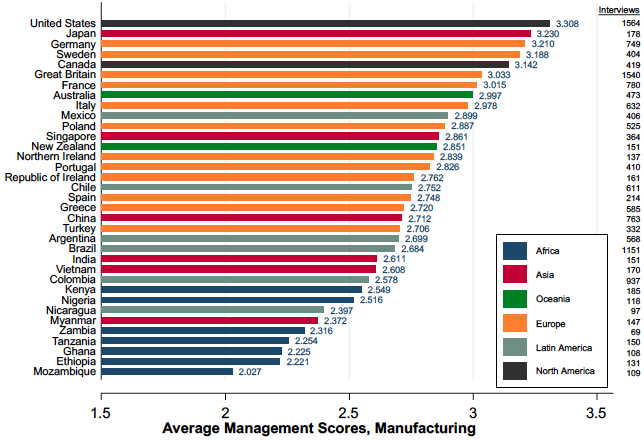
What’s the Connection Between Management Practices and the Wealth of Nations?

The graph above comes from a recent post by MIT economist John Van Reenen, who has been doing research on the economics of management for the last 15+ years.[ref]Reenen’s work was the foundation of my GBR article.[/ref] He explains,

Many case studies illustrate the importance of management. For example, one I was involved with was Gokaldas Exports (Bloom et al. 2013), a family-owned business founded in 1979 that had grown into India’s largest apparel exporter by 2004. It had 35,000 workers, was valued at approximately $215 million, and exported nearly 90% of its production. Its founder, Jhamandas H Hinduja, had bequeathed control of the company to three sons, each of whom brought in his own son. Nike, a major customer, wanted Gokaldas to introduce lean management practices and put the company in touch with consultants who could help to make this happen. But the CEO was resistant. It took rising competition from Bangladesh, multiple demonstration projects, and finally the intervention of other family members (one of whom I taught in business school) to overcome this resistance. The new practices led to greatly enhanced performance.

Reenen’s work on the World Management Survey has shown that “large, persistent gaps in basic managerial practices…are associated with large, persistent differences in firm performance. Better-managed firms are more productive, grow at a faster pace, and are less likely to die…We performed a simple accounting exercise to evaluate the importance of management for the cross-country differences in productivity. We found that management accounted for about 30% of the unexplained TFP differentials driving the large differences in the wealth of nations.” He concludes,

As our Gokaldas case study mentioned above illustrated, many firms in developing countries may not even realise how weak their management practices are. Or, even when they do they realise this, they may not know how to improve things. Tools such as benchmarking and training can help spread information and knowledge in both of these dimensions. Governments and NGOs often do this, but such programmes are rarely evaluated in a rigorous way (for a survey, see McKenzie and Woodruff 2017). Doing so may be able to raise management and ultimately the wealth of emerging nations.

Once again, management matters.

Will Inexpensive Health Insurance Lead to Full Coverage?

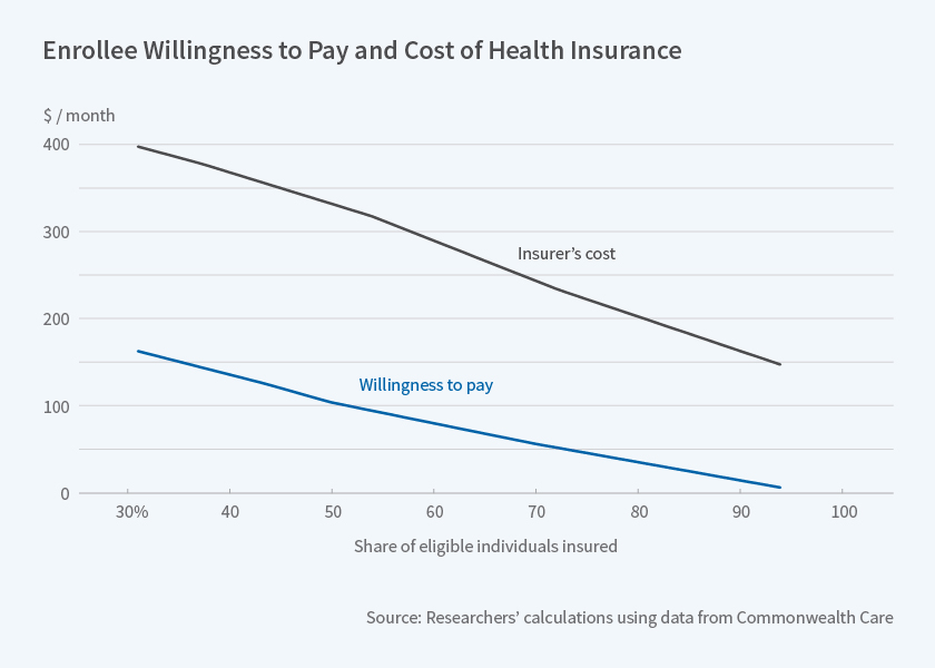
According to data from Massachusetts’ Commonwealth Care program, “even if 90 percent of health insurance costs were subsidized, 25 percent of those eligible for subsidies would choose to remain uninsured.” The program

offers large subsidies for private health insurance for individuals below 300 percent of the federal poverty level who are not covered by an employer plan or another public program, such as Medicare. The researchers analyze data from fiscal year 2011. Insurance payments were covered by a combination of Commonwealth Care subsidies and premiums paid by the eligible individuals. Enrollee premiums, intended to be affordable for low-income people, varied with income levels. Specifically, rate changes occurred at 150 percent, 200 percent, and 250 percent of the poverty line. The premium for the cheapest plan was $39 a month for enrollees with incomes between 150 and 200 percent of the poverty line, $77 a month for those from 200 to 250 percent, and $116 a month for those above 250 percent. All of these enrollee premiums were heavily subsidized relative to insurers’ costs, which averaged $359 per month. Individuals could choose to forgo coverage and pay a penalty equal to half the cost of the lowest premium.

The variation in the post-subsidy cost of insurance for low-income participants allows the researchers to estimate enrollees’ willingness to pay for health insurance. It also enables them to study how the set of enrollees who take up insurance affects provider costs. The researchers find that for each $40 increase in monthly premiums for the cheapest plan, enrollment in Commonwealth Care declined by about 25 percent, despite the penalty for opting out of coverage. When Commonwealth Care was free — as it was for those below 150 percent of the poverty line — 94 percent of eligible adults enrolled, but participation decreased to 70 percent when the premium rose to $39 per month, and to below 50 percent when premiums were $116 per month.

As individuals dropped out of coverage when their premiums became more expensive, average insurer costs per participant rose. At the 150 percent threshold, insurer costs increased by $47 per enrollee, or 14 percent. This indicates that the individuals who dropped coverage as the price increased were, on average, less expensive individuals to insure. In other words, the insured pool was adversely selected in terms of health risk.

The researchers estimate that individuals are willing to pay less than one-third of average insurer costs to obtain coverage. The median willingness to pay for insurance is $100 a month, roughly one-fourth of the cost of insuring individuals with above-median willingness to pay. Thus if a subsidy covers 75 percent of the cost of coverage, only half of eligible participants would choose to buy insurance. Even if the subsidy were 90 percent, 25 percent of those eligible would choose to remain uninsured.

Read the full working paper here.