A 2016 working paper explores the well-tread topic on income inequality, but with proper adjustments. These include:
Remove non-deductible losses before 1987
Include tax-exempt interest
Remove filers younger than 20 years old and remaining dependent filers
Remove non-resident filers
Correct number and income of non-filers
Correct for income sources
Include C corporation retained earnings
Include C corporation taxes
Include employer payroll taxes
Include employer provided health insurance
Measure income group sizes using the number of adults
Include Social Security benefits
Include unemployment insurance benefits
Include other cash transfers
Include Medicare
Include other non-cash transfers
When all is said and done, the researchers conclude,
Using unadjusted tax-based measures, Piketty and Saez (2003 and updates) estimate that between 1960 and 2013 top one percent pre-tax income shares increased by 10.0 percentage points. Using a consistent market income measure results in an increase of only 2.8 percentage points. Using a broad income measure with government transfers results in an increase of only 0.8 percentage points. Compared to unadjusted top one percent income shares, broad income shares were about 4 percentage points larger in the 1960s due to the inclusion of corporate retained earnings and taxes. They were about 5 percentage points lower in recent decades due to controlling for lower marriage rates outside the top of the distribution and including employer provided health insurance and government transfers. These differences illustrate how unadjusted tax-based income measures can present a distorted picture of inequality, as income sources outside the individual tax system can strongly impact inequality trends (pg. 14).
According to a new Brookings paper by Princeton economist Alan Krueger, “The increase in opioid prescriptions from 1999 to 2015 could account for about 20 percent of the observed decline in men’s labor force participation (LFP) during that same period.” Other findings include:
Regional variation in opioid prescription rates across the U.S. is due in large part to differences in medical practices, rather than varying health conditions. Pain medication is more widely used in counties where health care professionals prescribe greater quantities of opioid medication, with a 10 percent increase in opioid prescriptions per capita is associated with a 2 percent increase in the share of individuals who report taking a pain medication on any given day. When accounting for individuals’ disability status, self-reported health, and demographic characteristics, the effect is cut roughly in half, but remains statistically significant.
Over the last 15 years, LFP fell more in counties where more opioids were prescribed. Krueger reaches this conclusion by linking 2015 county-level opioid prescription rates to individual level labor force data in 1999-2001 and 2014-16. For more on the relationship between prescription rates and labor force participation rate on the county-level, visit these maps.
Krueger also found that “nearly half of prime age men who are not in the labor force take pain medication on a daily basis, and that two-thirds of those men—or about 2 million—take prescription pain medication on a daily basis.” Furthermore, “two-thirds of men not in the labor force and taking pain medication used Medicaid, Medicare, or Veterans Affairs health insurance to purchase prescription pain medication, with the largest group relying on Medicaid.” In short, “Krueger’s analysis reinforces past research in finding that the overall decline in LFP since 2007 is primarily due to an aging population and ongoing trends that preceded the recession, for example increased school enrollment of young workers.”
A new NBER paper looks at the decline in collective action promoting segregation and the rise of formal laws enforcing it. From the ungated version:
The goal of the analysis is to identify which of the two channels (i.e., increases in black housing demand and/or reductions in white vigilante activity) actually drove demand for passage of municipal segregation ordinances. Although our data and estimating strategies are limited, the patterns we observe are consistent with the predictions of the model, though the evidence for the vigilante channel is stronger than for the housing demand channel. In particular, whether we use city-level or ward-level data, we find only mixed evidence that demand for segregation ordinances is strongest in areas with the fastest growing black populations.
By contrast, we find relatively strong and robust evidence for the second channel involving white vigilante activity. Across a variety of model specifications and different measures of white vigilante activity, it is clear that in the cities where whites were able to police color lines and punish deviations through private channels, there was relatively little demand for segregation ordinances. For example, the data show that in cities located in counties with high lynching rates (a direct indicator of the ability of whites to organize privately to punish blacks for violating established racial norms) the probability of passing a segregation ordinance is significantly lower than in places with low lynching rates. Similarly, cities that possessed a robust volunteer fire department (an alternative measure of the ability to provide public goods through private channels) are significant less likely to pass a segregation ordinance. We supplement our city-level analysis with ward level data from St. Louis. With the ward-level data from St. Louis, we can identity which wards were the strongest supporters of the city’s segregation ordinance. The patterns observed in St. Louis suggest that support for the city’s segregation ordinance was strongest in the wards where it was difficult for white communities to coordinate private vigilante activity (pg. 4-5).
The authors conclude,
The existing literature on the origins of municipal segregation ordinances argues that segregation ordinances were passed largely because of rapidly growing black populations in urban areas and variation in the intensity anti-black preferences across cities. Our results suggest the existing literature needs to be revised. While there is evidence that growing black populations might have played a role in the propagation of segregation ordinances, the results here suggest that a decline in the ability of whites to provide a local public good (i.e. segregation) through private vigilante activity was especially important. In particular, the negative coefficient on lynching and the positive coefficients on white population growth are consistent with the hypothesis that segregation ordinances were passed in those cities where it was becoming increasingly difficult for whites to organize and punish blacks for violating established color lines in residential housing markets.
More generally, the model developed and tested here has broad implications for our understanding of residential segregation the processes that give rise to it. Of particular interest is the exploration of how market processes such as tipping interact with institutional change. While prior research has tended to treat market-related processes such as tipping independently from institutions, both formal and informal, the framework here integrates them. In the process, it can help us understand political institutions and market processes work together to drive segregation and make it persistent (pg. 34-35).
Economic and policy historian Phillip Magness has an enlightening post on Houston’s Harvey situation:
Older generations remember earlier storms and hurricanes that produced similar effects going back decades, although you have to return to December 6-9, 1935 to find an example that compares to Harvey’s stats.
Houston was a much smaller city in 1935, both in population and in geographical spread. But by some metrics the 1935 flood was even more severe. Buffalo Bayou – the main waterway through downtown – peaked at over 54 feet. Harvey, in all its devastation, hit “only” 40 feet by comparison. The 1935 storm dropped less rain, the maximum recorded being about 20 inches to the north of town where Houston’s main airport now sits. But it was also complicated by the problem of severe storms upstream that flowed into town and caused almost all of the other creeks and bayous that flooded last weekend to exceed their banks. Reports at the time noted that as much as 2/3rds of what was then rural and unpopulated farmland in surrounding Harris County saw flooding. Those areas are now suburbs today.
The effects of the 1935 flood on populated areas are also eerily similar to what we saw on television over the weekend. I recommend watching this film of the aftermath for comparison. All of downtown was underwater, as the film shows. People were stranded on rooftops as rivers of water emerged around them. There are even clips of rescuers navigating the streets of neighborhoods in small boats and canoes as water reached second and third stories on nearby buildings.
In the aftermath of the 1935 flood, the federal government commissioned an extensive study of Houston’s rainfall patterns. They produced the following map of the Houston storm’s effects, showing unsettling similarities to what we just witnessed (note that this map does not include the areas to the north of town, where rainfall in 1935 was significantly higher. These are the suburbs that flooded along Cypress and Spring Creeks last weekend and the farmland that similarly flooded in 1935)
And therein lies the importance of history to understanding what we just witnessed in catastrophic form this weekend. Houston floods fairly regularly. In fact, downtown Houston has suffered a major flood on average about once a decade as far back as records extend in the 1830s.
He continues:
…tropical storms and hurricanes throughout the 20th century revealed Houston’s continued vulnerability to storms.
The reasons have to do almost entirely with topography and geography. Houston sits on the gulf of Mexico in an active hurricane zone that attracts large storms. But more significantly, Houston’s topography is extraordinarily flat. The elevation drop across the entire city and region is extremely modest. Most local waterways are slow-moving creeks and bayous that wind their way through town and eventually trickle into the shallow, marshy Trinity bay. Drainage is slow on a normal day. During a deluge, these systems fill rapidly with water that effectively has nowhere to go.
We’ve seen a flurry of commentators in the past few days attributing Houston’s flooding to a litany of pet political causes. Aside from the normal carping about “climate change” (which always makes for a convenient point of blame for bad warm weather events, even as environmentalists simultaneously decry the old conservative canard about blizzards contradicting Al Gore), several pundits and journalists have opportunistically seized upon Houston’s famously lax zoning and land use regulations to blame Harvey’s destruction on “sprawl” and call for “SmartGrowth” policies that restrict and heavily regulate future construction in the city.
According to this argument, Harvey’s floods are a byproduct of unrestricted suburban development in the north and west of the city at the expense of prairies that would supposedly absorb rainwater at sufficient rates to prevent natural disasters and that supposedly served this purpose “naturally” in the past.
There are multiple problems with this line of argument that suggest it is rooted in naked political opportunism rather than actual concern for Houston’s flooding problems.
And here they are:
“flooding has been a regular feature of Houston’s landscape since the beginning of recorded history in the region. And catastrophic flooding – including multiple storms in the 19th century and the well-documented flood of December 1935 – predates any of the “sprawl” that has provoked these armchair urban designers’ ire.”
“the flooding we saw in Harvey is largely a result of creeks and bayous backlogging and spilling over their banks as more water rushes in from upstream. While parking lot and roadway runoff from “sprawl” certainly makes its way into these streams, it is hardly the source of the problem. The slow-moving and windy Brazos river reached record levels as a result of Harvey and spilled over its banks, despite being nowhere near the city’s “sprawl.” The mostly-rural prairie along Interstate 10 to the extreme west of the city recorded some of the worst flooding in terms of water volume due to the Brazos overflow, although fortunately property damage here will be much lower due to being rural.”
“a 2011 study by the Houston-Galveston Area Council…actually measured the ratio of impervious-to-pervious land cover within the city limits (basically the amount of water-blocking concrete vs. water-absorbing green land). The study used an index scale to measure water-absorption land uses. A low score (defined as less than 2.0 on the scale) indicates a high presence of green relative to concrete. A high score (defined as greater than 5.0) indicates high concrete and low levels of greenery and other water-absorbing cover. The result are in the map below, showing the city limits. Gray corresponds to high levels of pervious surfaces (or greenery). Black corresponds to high impervious surface use (basically either concrete or lakes that collect runoff). As the map shows, over 90% of the land in the city limits is gray, indicating more greenery and higher water absorption. Although they did not measure unincorporated Harris County, it also tends to be substantially less dense than the city itself.”
In short,
Houston’s flood problems are a distinctive feature of its topography and geography, and they long predate any “sprawl.” While steps have been taken over the years to mitigate them and reduce the severity of flooding, a rare but catastrophic event will unavoidably overwhelm even the most sophisticated flood control systems. Harvey was one such event – certainly the highest floodwater event to hit Houston in over 80 years, and possibly the worst deluge in its recorded history. But it is entirely consistent with almost 2 centuries of recorded historical patterns. In the grander scheme of causes for Harvey’s flooding, “sprawl” does not even meaningfully register.
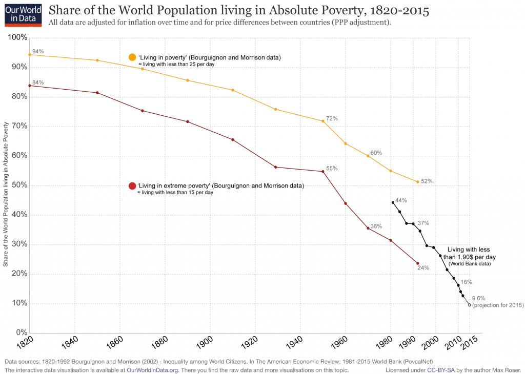
Poverty has been a moral issue at the center of philosophical, theological, and social thought for millennia. However, over the last two centuries, much of the world has experienced what Nobel economist Angus Deaton calls “the great escape” from economic deprivation. As a 2013 issue of The Economist explained, one of the main targets of the United Nations Millennium Development Goals (MDG) was to halve extreme poverty between 1990 and 2015. That goal was accomplished years ahead of schedule and the credit largely lies with one thing: “The MDGs may have helped marginally, by creating a yardstick for measuring progress, and by focusing minds on the evil of poverty. Most of the credit, however, must go to capitalism and free trade, for they enable economies to grow—and it was growth, principally, that has eased destitution.”
If this economic narrative is to be believed, then managing well is even more important in the fight against poverty. Research over the last decade finds that management—the day-in, day-out processes of everyday business—matters. As this article will show, economic growth has lifted billions of people worldwide out of extreme poverty via pro-growth policies (especially trade, property rights, and moderate government size). Good management, in turn, plays a significant part in this growth by increasing total factor productivity (TFP) and could therefore be considered a pro-growth policy. In short, those in management positions have the potential to improve the well-being of the global poor by learning to manage well.
I’ve lamented about this before. Funny enough, it was largely about the same source: The Guardian. A recent piece suggests that “neoliberalism” is responsible for, in the words of Forbes‘ Tim Worstall, the destruction of “everything that is good and holy about society.” This is based on a new IMF study that reviews the following:
Our assessment of the agenda is confined to the effects of two policies: removing restrictions on the movement of capital across a country’s borders (so-called capital account liberalization); and fiscal consolidation, sometimes called “austerity,” which is shorthand for policies to reduce fiscal deficits and debt levels. An assessment of these specific policies (rather than the broad neoliberal agenda) reaches three disquieting conclusions:
•The benefits in terms of increased growth seem fairly difficult to establish when looking at a broad group of countries.
•The costs in terms of increased inequality are prominent. Such costs epitomize the trade-off between the growth and equity effects of some aspects of the neoliberal agenda.
•Increased inequality in turn hurts the level and sustainability of growth. Even if growth is the sole or main purpose of the neoliberal agenda, advocates of that agenda still need to pay attention to the distributional effects.
In other words, it worries about financial openness and austerity. However, The Guardian describes it as such:
Three senior economists at the IMF, an organisation not known for its incaution, published a paper questioning the benefits of neoliberalism. In so doing, they helped put to rest the idea that the word is nothing more than a political slur, or a term without any analytic power. The paper gently called out a “neoliberal agenda” for pushing deregulation on economies around the world, for forcing open national markets to trade and capital, and for demanding that governments shrink themselves via austerity or privatisation. The authors cited statistical evidence for the spread of neoliberal policies since 1980, and their correlation with anaemic growth, boom-and-bust cycles and inequality.
Unfortunately for the author, that’s not quite accurate. The IMF researchers actually say,
There is much to cheer in the neoliberal agenda. The expansion of global trade has rescued millions from abject poverty. Foreign direct investment has often been a way to transfer technology and know-how to developing economies. Privatization of state-owned enterprises has in many instances led to more efficient provision of services and lowered the fiscal burden on governments.
Perhaps The Guardian author needs to be reminded that the IMF came out against protectionism last year in the midst of anti-trade rhetoric from politicians. Similarly, it released a report around the same time extolling the benefits of trade. Furthermore, the new IMF study qualifies its concerns:
The link between financial openness and economic growth is complex. Some capital inflows, such as foreign direct investment—which may include a transfer of technology or human capital—do seem to boost long-term growth. But the impact of other flows—such as portfolio investment and banking and especially hot, or speculative, debt inflows—seem neither to boost growth nor allow the country to better share risks with its trading partners (Dell’Ariccia and others, 2008; Ostry, Prati, and Spilimbergo, 2009). This suggests that the growth and risk-sharing benefits of capital flows depend on which type of flow is being considered; it may also depend on the nature of supporting institutions and policies.
…In sum, the benefits of some policies that are an important part of the neoliberal agenda appear to have been somewhat overplayed. In the case of financial openness, some capital flows, such as foreign direct investment, do appear to confer the benefits claimed for them. But for others, particularly short-term capital flows, the benefits to growth are difficult to reap, whereas the risks, in terms of greater volatility and increased risk of crisis, loom large.
This doesn’t strike me as a denunciation of “neoliberalism.” I’m going to follow Worstall’s lead on this one and refer to Max Roser’s work.
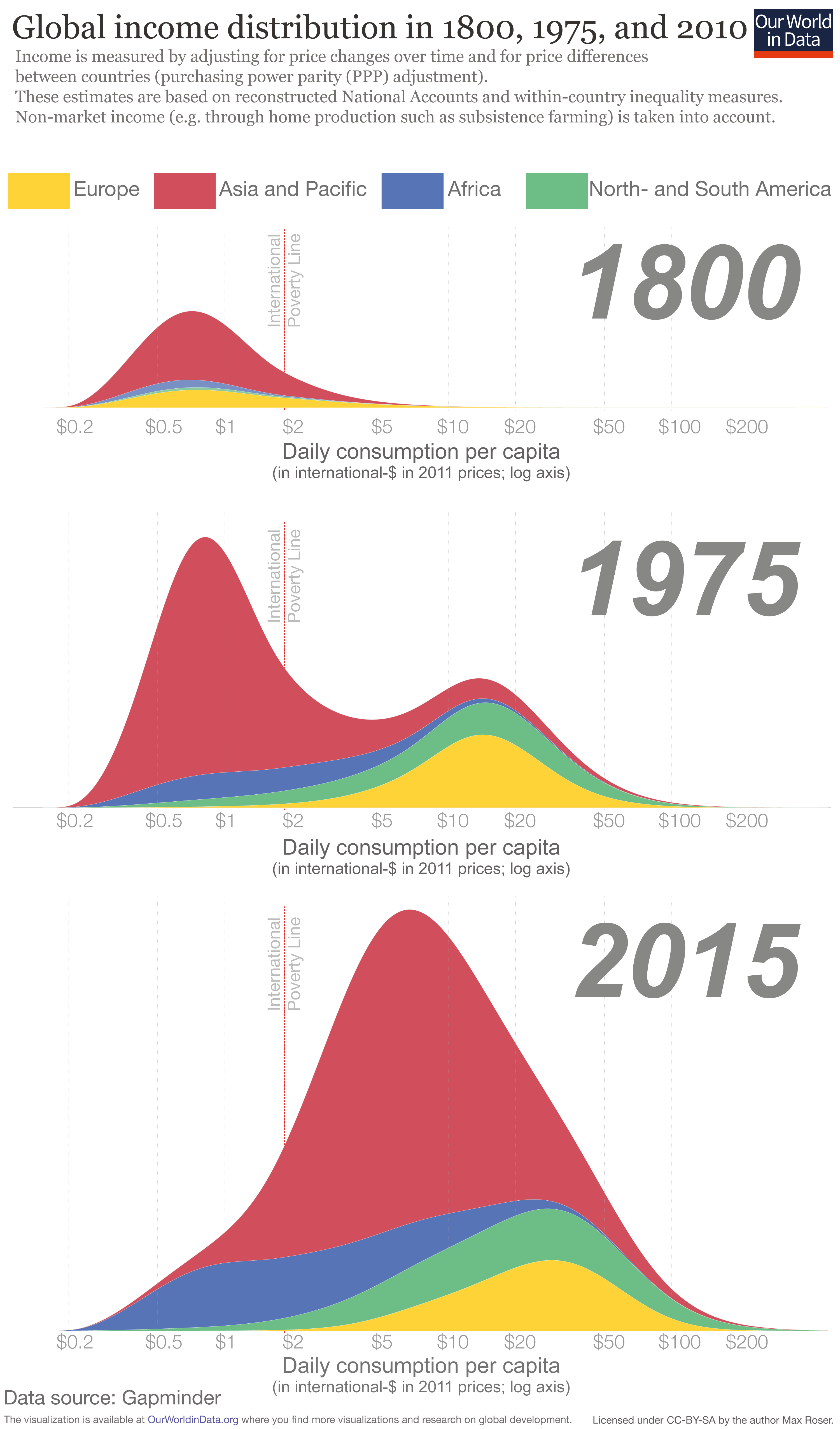
The distribution of incomes is shown at 3 points in time:
In 1800 only few countries achieved economic growth. The chart shows that the majority of the world lived in poverty with an income similar to the poorest countries in today. Our entry on global extreme poverty shows that at the beginning of the 19th century the huge majority – more than 80% – of the world lived in material conditions that we would refer to as extreme poverty today.
In the year 1975, 175 years later, the world has changed – it became very unequal. The world income distribution has become bimodal. It has the two-humped shape of a camel. One hump below the international poverty line and a second hump at considerably higher incomes – the world was divided into a poor developing world and a more than 10-times richer developed world.
Over the following 4 decades the world income distribution has again changed dramatically. The poorer countries, especially in South-East Asia, have caught up. The two-humped “camel shape” has changed into a one-humped “dromedar shape”. World income inequality has declined. And not only is the world more equal again, the distribution has also shifted to the right – the incomes of the world’s poorest citizens have increased and poverty has fallen faster than ever before in human history.
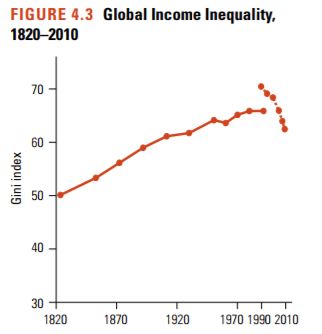
Globally, there has been a long-term secular rise in interpersonal inequality. Figure 4.3 shows the global Gini index since 1820, when relevant data first became available. The industrial revolution led to a worldwide divergence in incomes across countries, as today’s advanced economies began pulling away from others. However, the figure also shows that, in the late 1980s and early 1990s, the global Gini index began to fall. This coincided with a period of rapid globalization and substantial growth in populous poor countries, such as China and India.
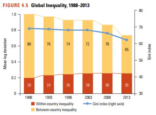
…Global inequality has diminished for the first time since the industrial revolution. The global Gini index rose steadily by around 15 Gini points between the 1820s and the early 1990s, but has declined since then (see figure 4.3). While the various methodologies and inequality measures show disagreement over the precise timing and magnitude of the decline, the decline since the middle of the last decade is confirmed across multiple sources and appears robust. The estimates presented in figure 4.5 show a narrowing in global inequality between 1988 and 2013. The Gini index of the global distribution (represented by the blue line) fell from 69.7 in 1988 to 62.5 in 2013, most markedly since 2008 (when the global Gini index was 66.8). Additional exercises confirm that these results are reasonably robust, despite the errors to which the data are typically subject (pg. 76, 81).
Harvard’s Andrei Shleifer has shown that between 1980 and 2005, world per capita income grew about 2% per year. During these 2.5 decades, serious hindrances on economic freedom declined, including the world median inflation rate, the population-weighted world average of top marginal income tax rates, and the world average tariff rates. “In the Age of Milton Friedman,” summarizes Shleifer, “the world economy expanded greatly, the quality of life improved sharply for billions of people, and dire poverty was substantially scaled back. All this while the world embraced free market reforms” (pg. 126).
A new study examines the link between immigrants and terrorism:
In our recent work (Dreher et al. 2017) we provide a detailed analysis of how the number of foreigners living in a country has affected the number of terrorist attacks made by foreigners on citizens of their host countries. According to the raw data, in OECD countries between 1980 and 2010, for every million foreigners in the population, 0.8 terror attacks are committed per year, per country (there were 662 transnational attacks). While it is obvious that the number of attacks increases with the number of people living in a country (after all, with no foreigners in a country, no foreigners would commit any attacks), on average these numbers amount to about one attack by foreigners per year and host country, and 1.3 people die from these attacks in the average country and year.
Transnational terror is dwarfed in absolute numbers by the number of attacks made by the domestic population. In the 20 OECD countries that our sample covers, there were 2,740 attacks arising from the domestic population. In relative terms though, the picture is different – there were fewer than 0.18 terrorist attacks for every one million locally born citizens in a typical country and year. Overall, while the probability that foreigners are involved in an attack on the domestic population was much higher than the risk that citizens were involved in attacks on their own country, the risk associated with each additional foreigner was tiny.
In our statistical analysis, we investigate whether, and to what extent, an increase in the foreign population of the average OECD country would increase the risk of terrorist attacks from foreigners in a host country. We identify exogenous variation in the number of foreigners living in an OECD country using changes in migration resulting from natural disasters. These changes affected host countries differently, according to the specifics of each host- and origin-country pair.
Using data for 20 OECD host countries, and 187 countries of origin between 1980 and 2010, we find that the number of terror attacks increased with the number of foreigners living in a host country. This scale effect that relates larger numbers of foreigners to more attacks does not imply, however, that foreigners are more likely to become terrorists than the domestic population. When we calculate the effect of a larger local population on the frequency of terror attacks by locals, the effect is of a comparable size. We conclude that, in this period, migrants were not more likely to become terrorists than the locals of the country in which they were living.
To put these results in perspective, consider the expected effect of a decrease in the domestic population of 0.0002% (which is the average decrease in the domestic population of the 20 OECD countries we studied in 2015, according to the OECD). According to our model, this would have reduced the number of terrorist attacks by 0.00025 per country and year. The increase in the stock of foreigners living in these countries was 3.6% in the same year. According to our estimates, this would have created 0.04 additional attacks. We might argue that this hardly justifies a ban on foreigners as a group.
We find little evidence that terror had been systematically imported from countries with large Muslim populations. The exceptions were Algeria and Iran, where we found a statistically higher risk of being involved in terrorist attacks against the local population, compared to the average effect of foreigners from non-Muslim countries. In this light, the phrases ‘Muslim terror’ or ‘Islamist terror’ does not seem accurate or useful. Only 6% of the terrorist attacks in the US between 1980 and 2005 period were carried out by Muslims, and less than 2% of all attacks in Europe had a religious motivation between 2009 and 2013 (Alnatour 2017).
Contrary to the expectations of many politicians and pundits, introducing strict laws that regulate the integration and rights of migrants does not seem to have been effective in preventing terror attacks from foreign-born residents. We rather find that repressing migrants already living in the country with these laws has alienated a substantial share of this population, which increases the risk of terror. Stricter laws on immigration thus have the potential to increase the risk of terror, at least immediately following the ban.
…Our results illustrate an important trade-off. While stricter immigration laws could reduce the inflow of (violent) foreigners and thus potentially the number of future terrorist attacks, the restrictions would also increase the probability that those foreigners already living in the country become more violent. Immigration bans, like those recently introduced in the US, would arguably increase the short-term risk of attacks, before potentially reducing risk when the number of foreigners in the population has decreased.
Other studies show that an increased minimum wage causes firms to incrementally move toward automation. Now, this too could be seen as a trade-off: automation and technological progress tend to make processes more efficient and therefore increase productivity (and eventually wages), raising living standards for consumers (which include the poor). Nonetheless, the point is that while unemployment in the short-term may be insignificant, the long-term effects could be much bigger. For example, one study finds that minimum wage hikes lead to lower rates of job growth: about 0.05 percentage points a year. That’s not much in a single year, but it accumulates over time and largely impacts the young and uneducated.
Now comes the new NBER working paper, “People Versus Machines: The Impact of Minimum Wages on Automatable Jobs” by Grace Lordan and David Neumark (bold is mine):
“Based on CPS data from 1980-2015, we find that increasing the minimum wage decreases significantly the share of automatable employment held by low-skilled workers. The average effects mask significant heterogeneity by industry and demographic group. For example, one striking result is that the share in automatable employment declines most sharply for older workers. An analysis of individual transitions from employment to unemployment (or to employment in a different occupation) leads to similar overall conclusions, and also some evidence of adverse effects for older workers in particular industries. … Our work suggests that sharp minimum wage increases in the United States in coming years will shape the types of jobs held by low-skilled workers, and create employment challenges for some of them. … Therefore, it is important to acknowledge that increases in minimum wage will give incentives for firm to adopt new technologies that replace workers earlier. While these adoptions undoubtedly lead to some new jobs, there are workers who will be displaced that do not have the skills to do the new tasks. Our paper has identified workers whose vulnerability to being replaced by machines has been amplified by minimum wage increases. Such effects may spread to more workers in the future.”
Three things: First this study is a great companion piece to a recent one by Daron Acemoglu and Pascual Restrepo analyzing the effect of increased industrial robot usage between 1990 and 2007 on US local labor markets: “According to our estimates, one more robot per thousand workers reduces the employment to population ratio by about 0.18-0.34 percentage points and wages by 0.25-0.5 percent.”
Second, Lordan and Neumark note that minimum wage literature often, in effect, ends up focusing on teenager employment as it presents aggregate results. But that approach “masks” bigger adverse impacts on some subgroups like older workers who are “more likely to be major contributors to their families’ incomes.” This seems like an important point.
Third, some policy folks argue that it’s a feature not a bug that a higher minimum wage will nudge firms to adopt labor-saving automation. (Thought not those arguing for robot taxes.) The result would be higher productivity and economic growth. But perhaps we are “getting too much of the wrong kind of innovation.”
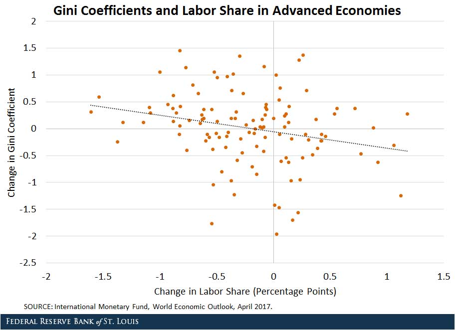
As the St. Louis Fed explains, “labor share declined 3.3 percentage points in advanced economies from 1980 to 2015”:
One of the explanations for the decline of the labor share has been an increase in productivity that has outpaced an increase in real wages, with several studies attributing half the decline to this trend.
This increase in productivity has been driven by technological progress, as manifested in a decline in the relative price of investment (that is, the price of investment relative to the price of consumption).As the relative price of investment decreases, the cost of capital goes down, and firms have an incentive to substitute capital for labor. As a result, the labor share declines.
The decline in the labor share that results from a decline in the relative price of investment has contributed to an increase in inequality: A decrease in the cost of capital tends to induce automation in routine tasks, such asbookkeeping, clerical work, and repetitive production and monitoring activities. These are tasks performed mainly by middle-skill workers.
Hence, these are the segments of the population that are more affected by a reduction in the relative price of investment. The figure below displays the correlation between changes in the advanced economies’ labor share and their Gini coefficients (which measure income inequality).
The Fed concludes,
Technological progress promotes economic growth, but as the findings above suggest, it can also reduce the welfare of a large part of the working population and eventually have a negative effect on economic growth.[ref]For more information on this last claim, see the recent research from the IMF.[/ref]
An important role for policymakers would be to smooth the transition when more jobs are taken over by the de-routinization process. At the end of the day, technology should relieve people from performing repetitive tasks and increase the utility of our everyday lives.
The Handmaid’s tale as a TV show is apparently a big deal. I don’t know about that. I really liked the book when I read it a few years ago, but I dreaded it being made for TV and haven’t checked the show out. Anyway, because the show is a big deal, I see lots of references to it on Facebook. Here’s one that stood out:
Better never means better for everyone. It always means worse for some.
The line is from the book, and it made it into the show, too. Of course it did.
The sentiment is very, very far from unique. In fact, it’s pretty close to universal among the left-wing of American politics. It’s actually pretty common on the right, too, since it’s more about populism than it is about left/right ideology. It crops up all the time. Just as one more example, here’s another left-leaning author in another overtly ideological (but not nearly as aesthetically accomplished) book[ref]It’s A Closed and Common Orbit by Becky Chambers. Here’s my review.[/ref]:
“Everybody’s history is one long slog of all the horrible shit we’ve done to each other.”
“It’s not all that,” Tak said. “A lot of it, yes, but there’s good things, too. There’s art, and cities, and science. All the things we’ve discovered. All the things we’ve learned and made better.”
“All the things made better for some people. Nobody has ever figured out how to make things better for everybody.”
“I know,” Tak said.
So, that’s one theory of human existence: in all of our history (and for hundreds of years into our imagined future) progress for everyone is impossible.
On the other hand, here’s the reality[ref]This is Walker’s favorite graph, btw.[/ref]:
I understand the idea of living in a fantasy world if the fantasy is better than reality. I can even understand extending this wishful thinking to fantasies that don’t actually seem very nice. That’s what conspiracy theories are all about, after all. Some people would rather believe in a world where things happen for a reason (and that reason is the Illuminati) rather than believe in a world where things are pretty random and chaotic because the Illuminati running everything is less scary than nobody running anything. OK. Not my cup of tea, but OK.
What I don’t understand is choosing to live in fantasy world that is so much grimmer than reality for no discernible benefit.
Which makes you wonder: what motivates this belief–contradicted by all available evidence–that universal improvement is impossible?
When it comes to the motivations behind redistribution, it turns out that fairness has little to do with it. Instead, researchers find[ref]Full access here.[/ref] that compassion, envy, and self-interest are the main drivers. From the abstract:
Why do people support economic redistribution? Hypotheses include inequity aversion, a moral sense that inequality is intrinsically unfair, and cultural explanations such as exposure to and assimilation of culturally transmitted ideologies. However, humans have been interacting with worse-off and better-off individuals over evolutionary time, and our motivational systems may have been naturally selected to navigate the opportunities and challenges posed by such recurrent interactions. We hypothesize that modern redistribution is perceived as an ancestral scene involving three notional players: the needy other, the better-off other, and the actor herself. We explore how three motivational systems—compassion, self-interest, and envy—guide responses to the needy other and the better-off other, and how they pattern responses to redistribution. Data from the United States, the United Kingdom, India, and Israel support this model. Endorsement of redistribution is independently predicted by dispositional compassion, dispositional envy, and the expectation of personal gain from redistribution. By contrast, a taste for fairness, in the sense of (i) universality in the application of laws and standards, or (ii) low variance in group-level payoffs, fails to predict attitudes about redistribution.
Let’s dive into the details:
We conducted 13 studies with 6,024 participants in four countries to test the hypothesis that compassion, envy, and self-interest jointly predict support for redistribution. Participants completed instruments measuring their (i) support for redistribution; (ii) dispositional compassion; (iii) dispositional envy; (iv) expected personal gain or loss from redistribution (our measure of self-interest); (v) political party identification; (vi) aid given personally to the poor; (vii) wealthy-harming preferences; (viii) endorsement of procedural fairness; (ix) endorsement of distributional fairness; (x) age; (xi) gender; and (xii) socioeconomic status (SES) (pg. 8422).
The results?:
To test this prediction, we regressed participants’ support for redistribution simultaneously on their dispositional compassion, their dispositional envy, and their expected personal gain (or loss) from redistribution. As predicted, the three motives have positive, significant, and independent effects on support for redistribution. This is true in the four countries tested: the United States (US) (study 1a), India (IN) (study 1b), the United Kingdom (GB) (study 1c), and Israel (IL) (study 1d)—standardized regression coefficients (β values): compassion, 0.28–0.39; envy, 0.10–0.14; self-interest, 0.18–0.30. Jointly, these motives account for 13–28% of the variance in support for redistribution. Adding to the regression models age and gender, or age, gender, and S[ocio]E[conomic]S[tatus], does not appreciably alter the effect of the emotion/motivation triplet, or the total variance accounted for. We note that age did not have significant effects in any country. Gender had significant effects in the United States and the United Kingdom (females more opposed to redistribution), but not in India or Israel. SES had a significant (negative) effect in the United Kingdom, but not in the other countries (Ibid.).
Unsurprisingly, in the U.S. “self-described Democrats endorsed redistribution to a greater extent than Republicans and Libertarians did. Democrats also reported more compassion and more expected personal gain from redistribution than Republicans and Libertarians did; envy did not differ by party” (Ibid.). Interestingly enough, “dispositional compassion was the only reliable predictor of giving aid to the poor” in all four countries. However, “support for government redistribution was not a unique predictor of personally aiding the poor in the regressions…Support for government redistribution is not aiding the needy writ large—in the United States, data from the General Social Survey indicate that support for redistribution is associated with lower charitable contributions to religious and nonreligious causes” (Ibid.).
Compassion
Now consider these absurd answers from the survey respondents:
Participants in the United States, India, and the United Kingdom (studies 1a–c) were given two hypothetical scenarios and asked to indicate their preferred one. In one scenario, the wealthy pay an additional 10% in taxes, and the poor receive an additional sum of money. In the other scenario, the wealthy pay an additional 50% in taxes (i.e., a tax increment five times greater than in the first scenario), and the poor receive (only) one-half the additional amount that they receive in the first scenario. That is, higher taxes paid by the wealthy yielded relatively less money for the poor, and vice versa (63). To clarify the rationale for this trade-off, we told participants that the wealthy earned more when tax rates were low, thereby generating more tax revenue that could be used to help the poor. Fourteen percent to 18% of the American, Indian, and British participants indicated a preference for the scenario featuring a higher tax rate for the wealthy even though it produced less money to help the poor…We regressed this wealthy-harming preference simultaneously on support for redistribution, the emotion/motivation triplet, age, gender, and SES. Dispositional envy was the only reliable predictor (Ibid.).
In short, “Compassion and envy motivate the attainment of different ends. Compassion, but not envy, predicts personally helping the poor. Envy, but not compassion, predicts a desire to tax the wealthy even when that costs the poor” (Ibid.). The cries for fairness, though, have little to do with support for redistribution:
To sum up the set of fairness studies, in predicting support for redistribution, the effect of fairness as a group-wide concern is unreliable and of far smaller magnitude than the effect of the emotion/motivation triplet. This is true whether fairness is operationalized as uniformity in the application of laws and standards or as low (or null) variance in payoffs; whether distributional fairness is assayed between individuals (studies 2a, 2c, S1a, S2a, S2b) or between groups (“the rich,” “the poor”; studies 2b, S1b, S2c, S2d); and whether allocational decisions are hypothetical (studies 2a, 2b, S1a, S1b, S2c, S2d) or consequential (studies 2c, S2a, S2b) (pg. 8423).
So, why do people support redistribution?
They care about the poor and want to help them (Compassion).


 the following map of the Houston storm’s effects, showing unsettling similarities to what we just witnessed (note that this map does not include the areas to the north of town, where rainfall in 1935 was significantly higher. These are the suburbs that flooded along Cypress and Spring Creeks last weekend and the farmland that similarly flooded in 1935)


 To test this prediction, we regressed participants’ support for redistribution simultaneously on their dispositional compassion, their dispositional envy, and their expected personal gain (or loss) from redistribution. As predicted, the three motives have positive, significant, and independent effects on support for redistribution. This is true in the four countries tested: the United States (US) (study 1a), India (IN) (study 1b), the United Kingdom (GB) (study 1c), and Israel (IL) (study 1d)—standardized regression coefficients (β values): compassion, 0.28–0.39; envy, 0.10–0.14; self-interest, 0.18–0.30. Jointly, these motives account for 13–28% of the variance in support for redistribution. Adding to the regression models age and gender, or age, gender, and S[ocio]E[conomic]S[tatus], does not appreciably alter the effect of the emotion/motivation triplet, or the total variance accounted for. We note that age did not have significant effects in any country. Gender had significant effects in the United States and the United Kingdom (females more opposed to redistribution), but not in India or Israel. SES had a significant (negative) effect in the United Kingdom, but not in the other countries (Ibid.).
 Participants in the United States, India, and the United Kingdom (studies 1a–c) were given two hypothetical scenarios and asked to indicate their preferred one. In one scenario, the wealthy pay an additional 10% in taxes, and the poor receive an additional sum of money. In the other scenario, the wealthy pay an additional 50% in taxes (i.e., a tax increment five times greater than in the first scenario), and the poor receive (only) one-half the additional amount that they receive in the first scenario. That is, higher taxes paid by the wealthy yielded relatively less money for the poor, and vice versa (63). To clarify the rationale for this trade-off, we told participants that the wealthy earned more when tax rates were low, thereby generating more tax revenue that could be used to help the poor. Fourteen percent to 18% of the American, Indian, and British participants indicated a preference for the scenario featuring a higher tax rate for the wealthy even though it produced less money to help the poor…We regressed this wealthy-harming preference simultaneously on support for redistribution, the emotion/motivation triplet, age, gender, and SES. Dispositional envy was the only reliable predictor (Ibid.).